Working for a More Beautiful World
An Interview with Russian Graphic Designer Stepan Solodkov
Stepan Solodkov based in Estonia is a self-educated graphic designer who creates wonderful and thoughtful identities for brands. Besides working on projects in which typography plays an essential role, Stepan is keen on promoting Russian visual art as well as educating the public about design. I asked Stepan about his work, the typeface Helvetica and many more.
How did you end up being a graphic designer?
I started working as a designer 4 years ago. Before that I worked on the railway for a long time, but I realised I wasn’t doing my thing. Therefore, I invested time in self-education, I worked on my portfolio, and then I tried to get a job as a designer.
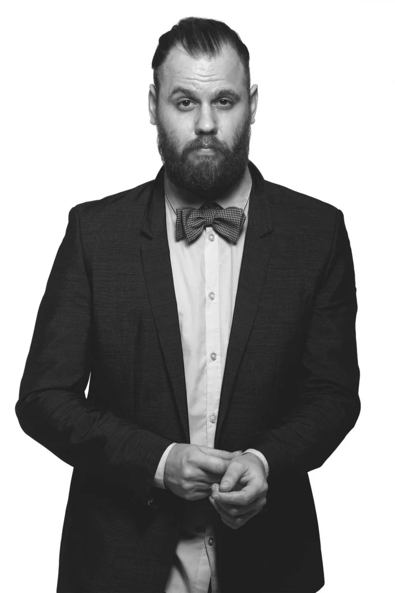
Stepan Solodkov
Please, briefly talk about the Russian design and typography traditions. What are the main characteristics of them?
I’m afraid I cannot answer this question in more detail, because graphic design in Russia is pretty young, and we don’t really have established design schools like in Germany or Switzerland, for example. However, I can tell you that Russian design is multifaceted, and one can find a lot of talented designers there. Now in the Internet age there is no information vacuum, so designers can follow what their colleagues around the world are doing, yet I’d say we are cultivating our own style.
You’re a co-creator of a festival organised in Chelyabinsk, Russia. Please, tell us about it.
I was one of the organisers at the Behance Portfolio Review in my hometown. This is an international event that takes place under the patronage of Behance. Such events are held twice a year around the world. Behance associates themselves with designers and offers to hold such an event in their respective cities. It also helps with prizes and gives advice on planning the event, but the organisers in each city have the freedom to organise the event as they wish.
At your workplace you hang the poster of the film Helvetica directed by Gary Hustwit. In the film we can see that someone loves Helvetica, someone hates it. I’m wondering what you think about the film and the typeface.
I really love this film. It’s just beautifully shot, and interesting, even for non-professionals, I tested it on my wife. This font is unique and certainly very important for a graphic designer; it still inspires millions of designers even after a lapse of 60 years.
What films and/or magazines, websites, etc. would you recommend to people interested in graphic design and typography to learn or find inspiration?
My favourite site is certainly Behance, but I can also mention The Dieline. However, I mostly monitor works not blogs or thematic sites. I follow my favourite studio’s online activities.
What drives you as a designer?
I have the desire to make this world more beautiful and more convenient. In my country visual culture does not really play a significant role, and my aim is to change that. I’d like to teach people how to see and notice beautiful and intelligent design.
Have you developed some extreme habits while working on projects?
I don’t have a certain routine while working on a project, but I think it must be the same as most designers do: analysis, choice of style, searching for ideas, rendering. These are the main stages unless the client provides me with a detailed brief.
You are present on more (social media) sites to showcase your work. Do you post strategically or just follow your instincts?
Just trying to do so that my work could reach a large number of people. My work might be an inspiration for some people.
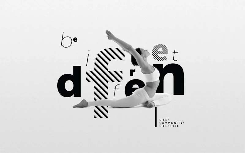
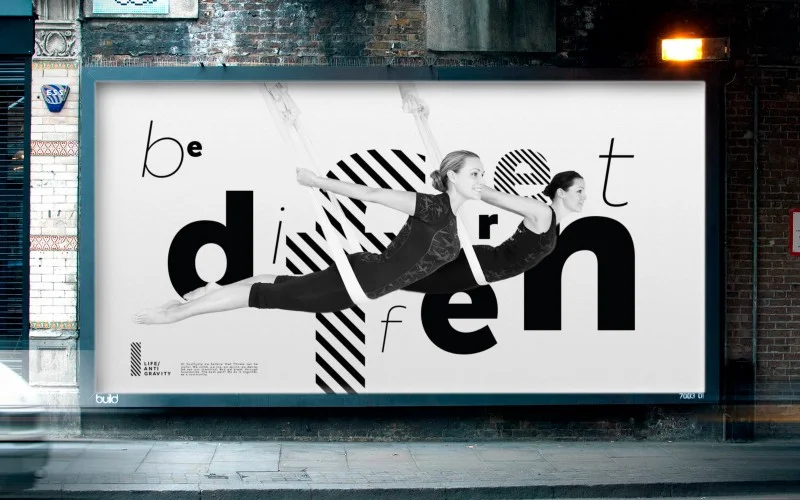
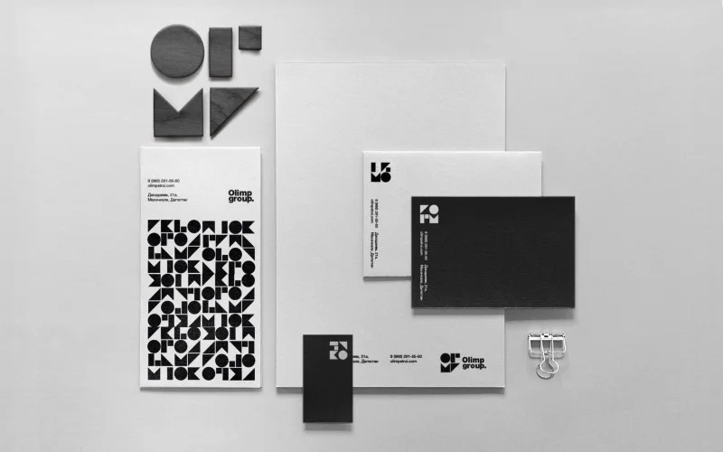
The identity of both Life Concept and Olimp Group demonstrates your passion for typography. How did those concepts come to life?
Typography in these projects is used to enhance the message for what these brands carry. In the Life project the main message was: “Be different! Do not play sports just because of the influence of society or fashion! It does not matter how you look, if it brings you pleasure, do it! Live your life as you wish!” This is what I tried to show in typography, also with the different letters in the words written on various surfaces. I also tried to illustrate every single form of sports in the club with the letters. Each capital letter “L” has similar characteristics with the practice it illustrates. As for the project Olimp Group, it’s a construction company, and I created their logo based on simple shapes that represent building blocks. As a result of that, the letters in the logo can be rearranged, so the company is able to generate a new unique logo from time to time, yet the logo remain recognizable at the same time.
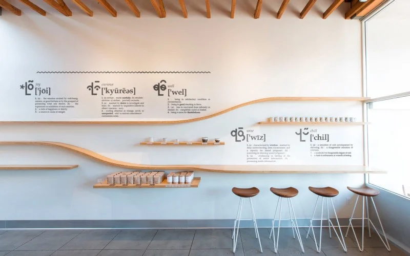
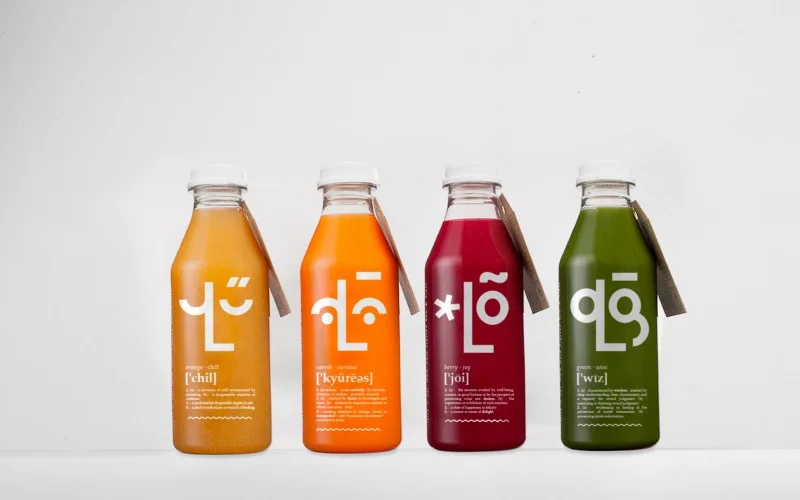
Typography plays a significant role in the branding you did for Olo. The identity is playful, yet very minimalist. How did you develop the concept?
When they contacted me, they had already had this name Olo. They told me it was a unique name, and it did not mean anything. They wanted the identity to be friendly and to contain some kind of characters. After doing some research I found out that in Finnish there is such word that means emotion. So the word itself became such a cheerful character of the identity with a whole sea of emotions, which I drew using only typographic symbols. Since the client had no idea that there was such word as olo, their target audience most likely thought the same. But how do people learn about the meaning of the word? I asked myself. Of course, they turn to a dictionary. This thought led me to develop the project, and all the stylistic elements were designed accordingly.
What would be your dream project?
A dream project can be any project when the client completely trusts me as a professional.
What are you working on right now?
As soon as something interesting comes up I definitely post it in my Behance profile.
What are your plans?
I’d like to get recognised by the professional community and be present at graphic design festivals such as Red Dot, EDA, and D&AD.
