‘Style Needs No Colour’
An Interview with Bolivian Designer Mathew Prada
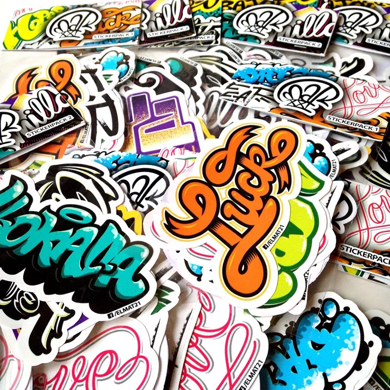
Mathew Prada, aka Mat21, is a Bolivian graffiti artist, graphic designer, typographer, letterer and educator. He has been around for years now, and his works have been showcased in many places, but he is keen on learning. I asked him about his career and the Bolivian graffiti and typography scene.
You’ve been working as an artist for several years now. I’m wondering how you became a graphic artist?
Since I was a kid I’ve always liked graphics and visual stuff, and then I started doing graffiti just like any teenager. Later I studied graphic design, and I heavily focused on typography.
Unfortunately, I don’t know anything about the Bolivian design and art scene, therefore, I’d like to ask you to briefly summarise what everyone should know about the Bolivian graffiti, typographic and lettering traditions.
Regarding graffiti, there has been plenty of bombing (illegal tagging) going on since the 90s. There was a lack of elaborate graffiti pieces in the past, but thanks to better spray can imports by graffiti shops today the quality of them is improving and the quantity of them is increasing. The typography and lettering scene is not that developed, probably just a couple of local fonts have been officially released, but there are more and more lettering artists.
What position do you think Bolivian design hold in the context of South America and in the world?
Unfortunately, Bolivian contemporary design does not really have a strong status in South America, but something important we have is the huge Biennial of the Poster Bolivia BICeBé. A lot of designers from the region visit it every year to learn and find inspiration.
What are the main portfolio sites in Bolivia creatives use to showcase their work and possibly find new clients?
Mostly Facebook, and Instagram and Behance.
Do you aim at working rather nationally or internationally?
Internationally, but I don’t want to leave the national work aside.
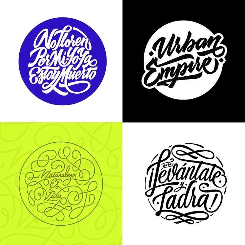
Just by looking at your pieces, it becomes obvious that you aren’t afraid of combining different patterns, colours, forms or even styles in one particular work. It demonstrates that you have lots of ideas. I’m wondering what the design and execution process is like. Do you have a clear concept in your head before realising your ideas on paper or on the computer, or do you only have an initial thought that you develop further while executing the ideas manually or digitally?
As any idea, mine starts with an initial thought, then I develop and clear it up before the manual execution. Sometimes more stuff comes out as I sketch, but that’s not very common for me.
You do graffiti, calligraphy and lettering, and the former two are mostly associated with manual processes. Do you prefer working manually or digitally?
99% of what I do starts manually, but I also enjoy digital work. I can say I love both.
Black-and-white or colours?
B&W. Style needs no colour.
You work in a field where you need to constantly evolve and create newer and newer ideas. Do you think it’s possible for someone to develop her/his own style while always adapting to someone else’s concepts and trying not to repeat themselves?
I guess it’s possible. I’d say that trying not to repeat oneself is an important part of style development, and it’s a better way to apply new concepts than adapting to someone else’s.
How do you describe your own style?
Difficult to say now, since I’ve been learning new stuff lately, and I’m trying to apply it to my former knowledge and practice. So right now, at least for me, it’s kinda blurred, and I’d prefer other people to describe how they see my style.
What drives you as an artist?
My love and passion for letterforms and putting lines on something.
What are your sources of inspiration?
Anything visual, really.
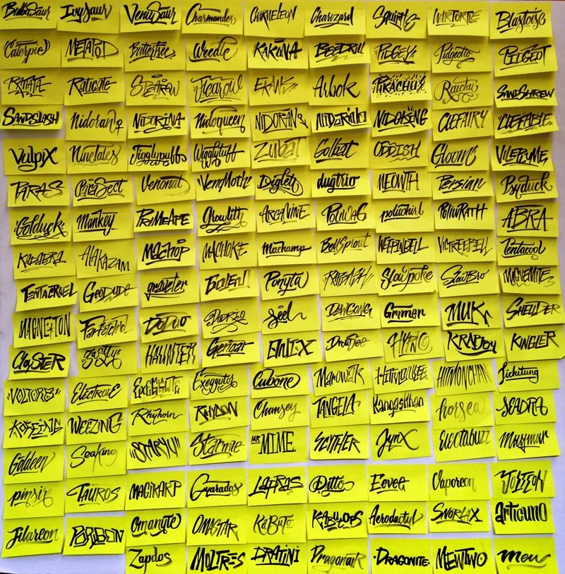
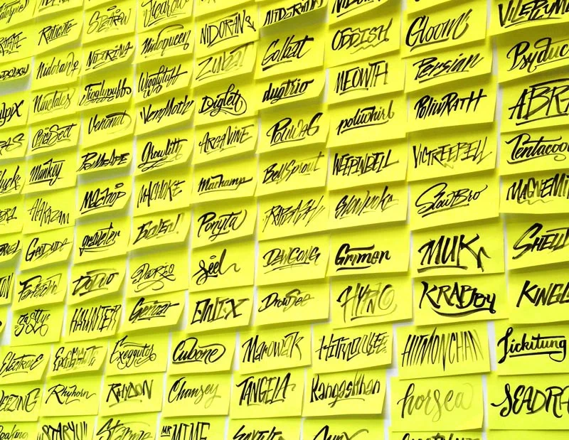
Typokémon is one of your biggest projects. Please tell us about the idea and the creative process.
I’ve always wanted to make a decent tribute to my childhood, what better way to do it than expressive calligraphy! There’s nothing much to it, I tried to somehow communicate the look and feel of each Pokémon by writing their names. It was kind of a long process, but it was really fun to write all 151.
You’ve participated in exhibitions in different countries. What do you like the most and least about this kind of events?
What I like the most is looking at my stuff printed and hanged up, sometimes right beside works of people who I am a fan of. As of now, I don’t really have something that I dislike.
What is the most precious memory of them?
My most precious memory of these events would be attended the previously mentioned poster biennial as a guest designer. Everybody approached me and asked for autographs. That was crazy (good)!
When and where can we see your work in the near future?
Just the usual: on Behance, Instagram and Facebook. Stay tuned!
What are you currently working on?
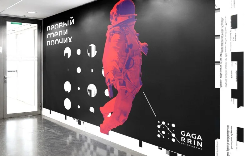
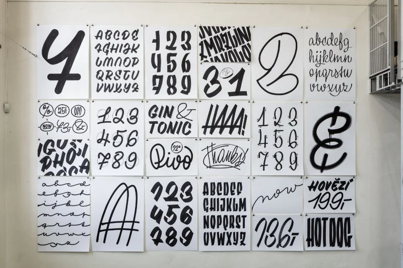
I teach typography at a local university, and besides that I always work on custom lettering and logotypes for clients – expanding letter styles/execution and learning typeface design.
What are your plans?
I have many projects in progress, but those are still secret. I’d also want to improve my knowledge of typography. In addition to that, I really enjoy teaching anything about letters, so I’m planning to stay as an educator.


