‘We Are Interested in Our Own History’
TYPO Berlin: An Interview with Czech Type Designer Petra Dočekalová
If someone wants to learn about contemporary Czech typography, one should turn to Petra Dočekalová. It’s really not an exaggeration to say that Petra’s life is centred around type: She works in a type foundry, leads workshops to teach others about letterforms, showcases her typographic skills on Instagram, and her PhD research project is dealing with Czechoslovak calligraphy and lettering. I talked to Petra at TYPO Berlin back in May 2018.
Let’s start at the very beginning! How did you enter the world of design and typography?
Quite simply! I fell in love with scripts and letterforms at first sight. I studied graphic design in secondary school where I got really passionate about typography. I wanted to learn everything about scripts, fonts, typefaces, alphabets and letterforms. I started drawing them, and I wanted to gain even more knowledge of them, so I went to the Type Design & Typography studio at UMPRUM Academy in Prague, which was the best option to learn that all. My aim was to make typography more popular and the type community bigger — by editing books like TYPO9010, organising lectures and workshops, etc. around type. With my master’s degree, I came to the realisation that sign painting in the Czech Republic, unlike in other countries, is quite dead. So I intended to bring it back to life.
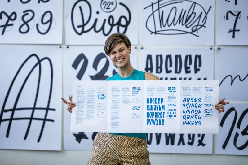
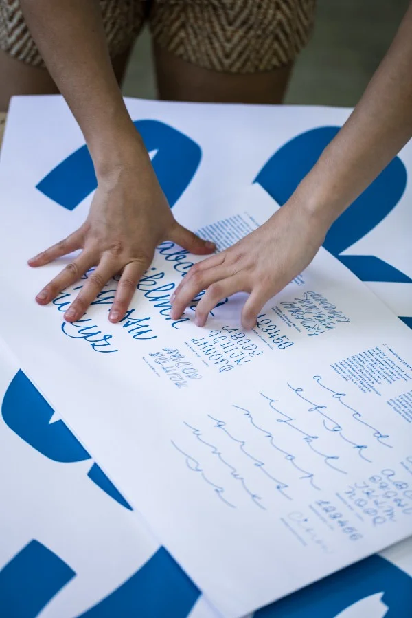
Petra Dočekalová | Photo by Peter Fabo
You’re currently writing your PhD. What is it about?
It is the extension of my master’s thesis, in which my focus was local advertising scripts and its contemporary transformations. Right now I’m doing research on 20th-century Czechoslovak script typefaces, lettering, manuscripts and advertising manuals. It’s going to be an overview of what has been done in different fields, ranging from typography to cartography and architecture, etc. It comes hand in hand with our other research on 20th-century Czech typefaces.
Sadly, we don’t have everything mapped regarding that era. Many aspects of it are either forgotten or absolutely unknown. For example, if in the 50s a museum received a folder of typefaces, they probably burnt it. They were not interested in type; compared to sculptures and paintings, type designs were insignificant. So lots of the materials were lost. Therefore, what we do now is to visit the personal archives of all of those typographers who were active in the 20th century. Besides learning about what they were creating for type competitions, we also try to find what they were designing for the drawer. It’s a huge amount of unpaid work actually, but it’s totally worth doing it!
Photo by Peter Fabo
What else makes your research more challenging?
Well, after WWII, all the small Czechoslovak printers that would cast types were merged into one national organisation called Grafotechna, which was founded in 1951. After that, nobody else had the permission to cast type, everything had to go through Grafotechna. So only a few pro-regime typographers were employed, and the others’ work was archived — that could have meant that their work got lost forever. Their descendants probably bequest their legacy to a museum or still keep their work in garages, but the major part of it has been possibly eaten up by rats.
It must be extremely difficult to find all the puzzles, so I’m wondering how you usually find the first lead and how you proceed afterwards.
Fortunately, we have the Internet now, so we have access to a wealth of information directly. And even if not so many archives were interested in typefaces before, if you search really deeply, you’ll get some results in some correspondence or so. Then one thing leads to another — you discover things that you have never known existed. You also search all the archives, which are located in and outside Prague, where you can find some other pieces of history. You usually find something at unexpected places.
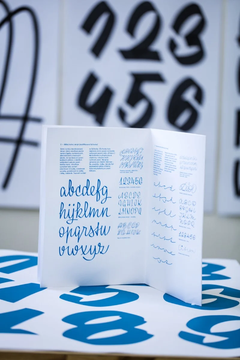
Photo by Peter Fabo
For example, last April we were at Monotype because they have a typeface by Jaroslav Benda we thought it was lost during the bombing of (not only) the Monotype Office in London in 1941. The question emerged: How did that typeface survive and end up there? Just to give you an idea: we also found some parts of the conversation between Benda and Monotype from 1936. We learnt about that Benda didn’t know that there was a Monotype archive in Salfords, 40km from London, where the sketches were stored, so he thought those were destroyed after WWII. This loss strongly influenced his following type designs. It took us one year to discover this evidence. So it’s a kind of detective work, but super fun!
You said the archives were not interested in type back then. What is the situation now?
It is completely different now; the work of the archives and the archivists has improved a lot. They are so kind and helpful. One sample of all: just see the amazing work of Rob Saunders & Letterform Archive in San Francisco. They even digitise the findings for you. There is no problem with sending an e-mail and get a photo back from another continent in a few hours.
Your research focuses on the 20th century, but what should we know about the earlier years of Czech typography?
The history of Czech and Slovak typography is dated when Czechoslovakia became a state in 1918. Before that, we were part of the Austro-Hungarian Empire, which meant typefaces were probably cast in Vienna, Leipzig, Munich or Berlin and the letterforms were designed by foreign authors. In 1905, Benda wrote in a correspondence: ‘Prague is just a “small village” located between Vienna and Munich.’
In the decade before WWI, there were a few attempts to design a national typeface; not merely because of the badly corresponding accents but mainly to use them on accidental posters. None of our artists succeeded, though. If we scrutinise the 14th century, we can track the Jan Hus’s reformation of diacritics that influenced the glyph set we use today. The oldest Bohemian type specimen comes from the 17th century — it’s the first printed specimen by Wenceslaum Joannem Crabath. Nevertheless, our recent history and the fact that we barely know everything about 20th-century type design are more important. If we want to create contemporary typefaces, we must know whether someone already created it or not. We are interested in local history. If we didn’t do this research, nobody would!
How do you imagine showcasing your results?
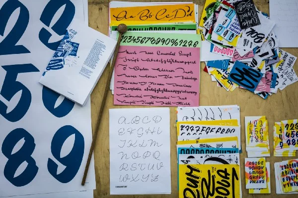
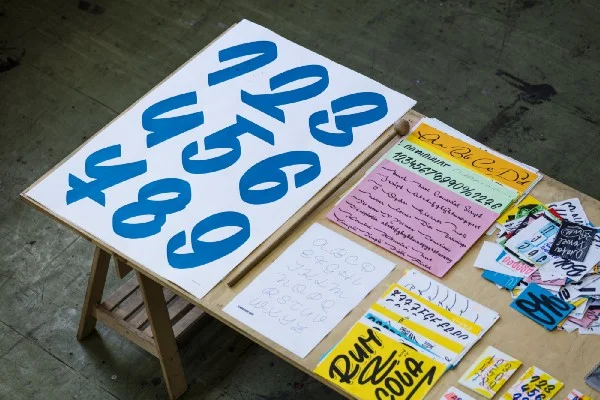
We are not theoreticians but practitioners and are balancing between archival and practical work. For example, when we worked on the TYPO9010 book, first we found the fonts, and the ones we didn’t find we simply digitised and redrew; a few of them were put into our Briefcase font library. Basically, it’s always about designing typefaces. We see the same potential with this research. Our plan is to release a book and fonts again. However, our work allows us to present the results in various ways, so stay tuned!
Hopefully, people will be intrigued to hear what you have found. Let’s talk a bit about your other work now. You’re the member of the Briefcase Type Foundry team. What kind of projects do you do at the foundry?
We are just three people (Tomáš Brousil, Radek Sidun and I), so we do everything from researching, teaching to type, editorial, website, book, and specimen design, etc. We do type engineering as well. Tomáš has another foundry named Suitcase Type Foundry that he also needs to devote time to. So we are really busy.
What kinds of projects do you like the most?
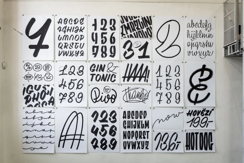
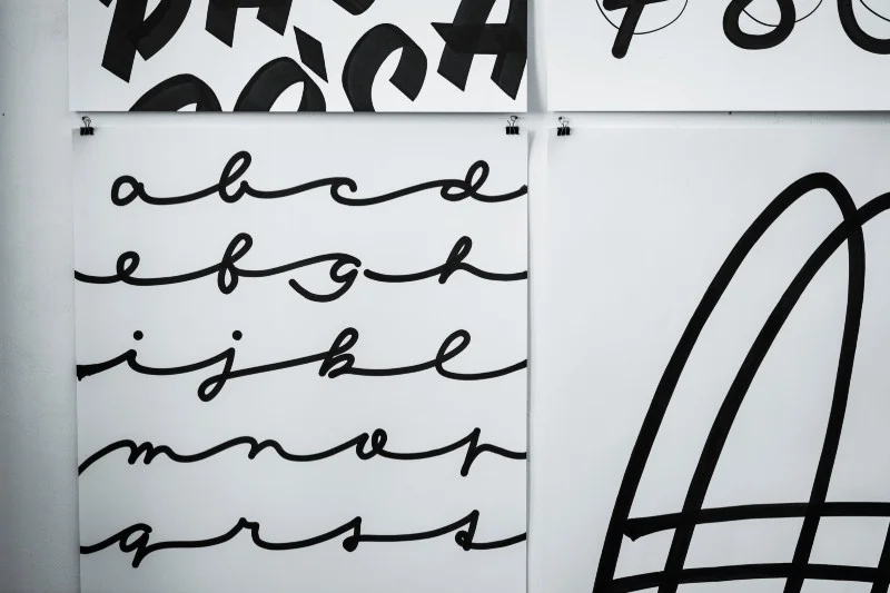
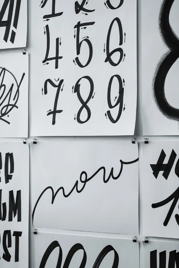
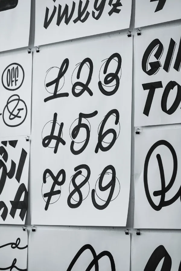
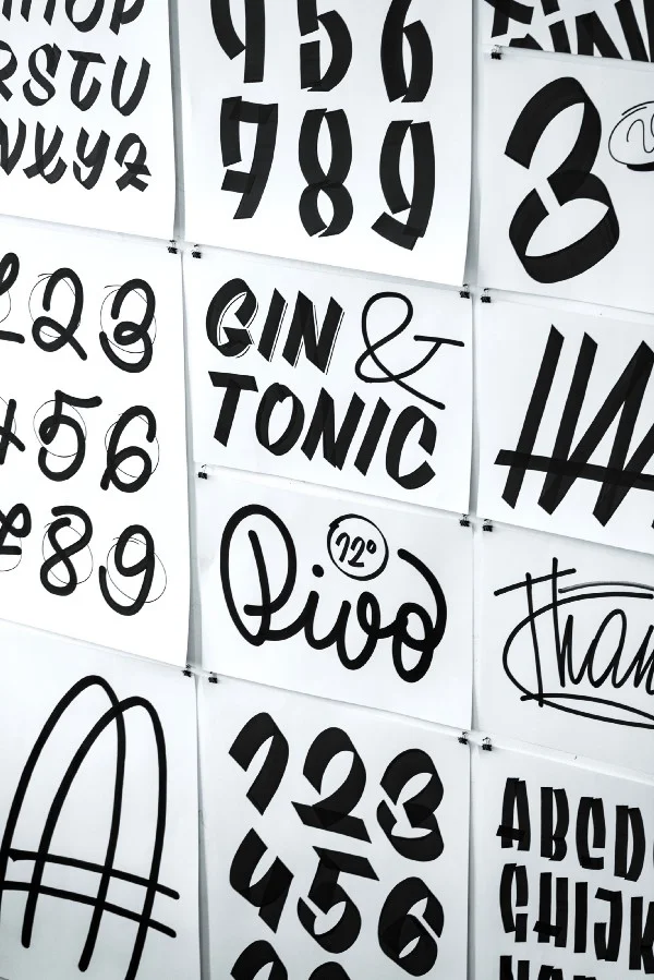
I like discovering, so all challenging projects, both independent & commercial ones. For now, it’s my PhD and the work on the new Briefcase typefaces. I can’t say I’m a 100% letterer, a type designer, or a calligrapher, etc. This type of terminology doesn’t exist for me. I just have fun with scripts and type, really. I like drawing new forms, letters, being original and creative. My time spent with markers, the results of which you can see on my Instagram page, is my fun time. It’s important to leave the computer once in a while and do something by hand.
When I talked to Hungarian designers, many of them said that sometimes it was rather difficult to talk to a client. They don’t necessarily understand how much work designers put into one project. What is your experience with clients in the Czech Republic like?
Sometimes they are like angels, they know the field, they pay you well, they give you enough time and are open to your ideas. Crazy, isn’t it? But more often they are like from hell. So it varies from client to client. When I do sign painting, for example, people are aware of how much work it is to provide great quality. They know that it’s hand-made and they appreciate my work.
It’s different with TYPO9010, as it is oriented towards the typography community, and we are mainly our own clients who give us the topic, the limits and the time for no money. We are doing it to map our history for future students, to give them the chance to rely on something and to be sure they can stand on some base. With the schoolwork, it’s really great that you can motivate the youth to do something that has meaning instead of just designing for another commission.
Photo by Peter Fabo
At the foundry, our clients are 50/50 local and foreign. Czech clients usually go for Suitcase typefaces. Tomáš opened his foundry in 2003, and if you’re in the business for 15 years, you’re taken seriously. You don’t need to convince your clients. We also tend to say no to clients if we think the project does not need our work. Sometimes we just advise clients on what solution would suit their need perfectly, because they’re somehow losing common sense. So we might end up directing them to the opposite way, but sometimes they don’t want to do that. In a way, you do this for the community to create a better visual environment.
What kind of advantages do you think you have in the region?
We have great power in diacritics, for example. As opposed to the English-speaking countries, we are used to working on diacritics from scratch. And because we do all the accents while designing, it looks like one complex system, not just like annoying insects above the letters.
To wrap up, what are your plans?
The results of this year will be the book about Jaroslav Benda, several new typefaces by Stanislav Maršo on Briefcase, and the development of my research. I’m looking forward to some holiday time, though.
Photo by Peter Fabo
