On Type, Urban Art & Building Communities
An Interview with Colombian Graphic Designer Laura Cárdenas Alvarado
Most of the time letters are used in books and magazines, but sometimes they decorate a fence to make people feel belonging somewhere. This is exactly what Bogotá-based graphic designer Laura Cárdenas Alvarado and her best friend aim at doing with Type of Tape. I talked to Laura about Colombian design and art as well as about her current and future projects.
To get started, I’d like to ask you about the beginnings. When did you decide to become a graphic designer?
I’ve always had a special interest in the arts and crafts. I acquired a taste for weaving, embroidery and painting because I was taught in my house since I was a child; and I also liked the architecture and design of spaces because there are many architects in my family. However, I became interested in being a graphic designer when I began to see their architecture magazines. I started to buy all kinds of magazines and that led me to focus on composition and typography, which are my main strengths and interests as a designer. Then with the Internet, it was also very easy to be bombarded by images all the time. I was impressed by the visual communication, and then I decided to study graphic design. Throughout my training, I attended several workshops in calligraphy, typography, printing techniques and graphic communication, and manual techniques. I think this mix of disciplines allowed me to explore interesting things in design.
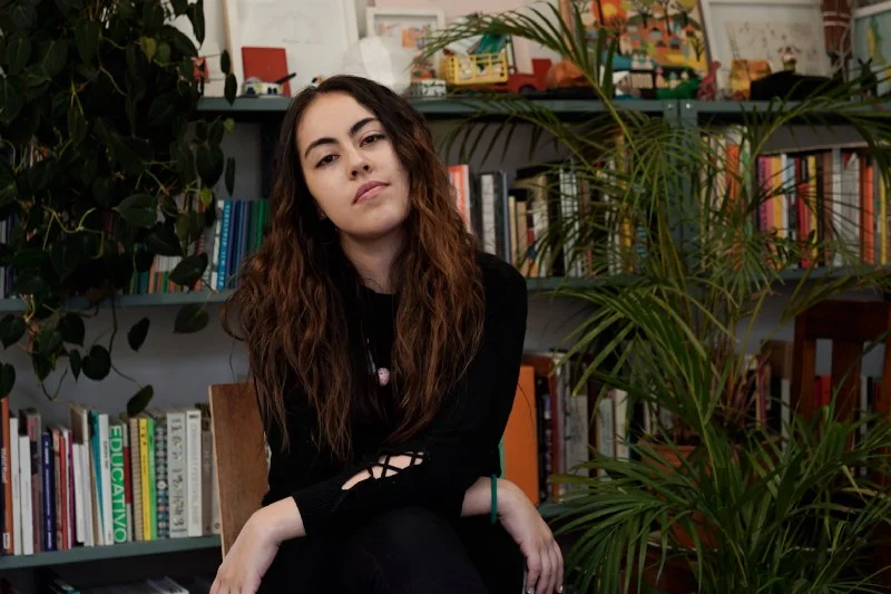
Laura Cárdenas Alvarado | Photo by German Camilo Leal
Unfortunately, here in Europe, we can’t really hear so much about Colombian design, arts and culture, but I would love to know more about them. What exactly are the characteristics of them?
Colombia is a multicultural country; here you can find all kinds of customs and artistic, musical and cultural expressions. Personally, I think this is what that makes us a very rich country. Colombian arts and design are very influenced by these factors, as well as by our history, and therefore literature, fashion, art, music, film and design have a very strong and unique cultural context. There are many voices in Colombian design. I can’t tell you that there is a specific character to it because we have many influences, from international design to local customs. I would say we are designers of mixes.
What position do you think Colombian design holds in the context of South America, in the Americas, and in the world?
The cultural context in Latin America is very powerful. Countries like Peru, Mexico, Argentina or Brazil have very marked and recognizable forms of graphic expression. In Colombia, on the other hand, there had not been enough space for the arts. Our political and social context has been extremely complicated, but we are in a transition. There are more spaces for expression, and more designers feel the need to experiment.
Strictly based on your Behance profile, it seems you like collaborating with other designers, so there must be a community out there. What do you think the biggest challenges and greatest opportunities designers in the region have?
The collaborative projects are very nice to do; when you work with others you grow a lot as both a designer and a person. It helps to set challenges and overcome them, and, of course, to create a community that is very important in our country. The biggest challenge in Colombia is that there is a lack of design culture. Often there is not enough trust and respect coming from the clients, and designers are subject to traditional forms of expression, or to develop what the client expects without going ‘beyond’. However, it is a path that must be built. We must propose and defend our work in order to see a growth in the culture of design. Additionally, creating a community is essential to consolidate design as a respectable field. We must appreciate our work, do it well, and defend it with the same passion we use when we create.
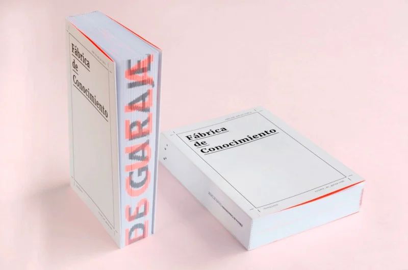
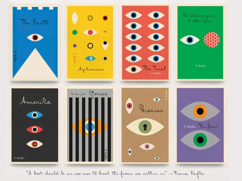
Book | Escuela de garaje
You work on editorial design projects a lot. Why do you enjoy designing books, magazines, etc.?
Designing prints is one of my greatest passions. I enjoy working on editorial material because I deeply believe in the power of reading. When I design these pieces, I always learn, and when I see the books or magazines I designed printed, I feel happy to have helped to give a ‘graphic voice’ to those texts. In editorial design, an identity of texts is created. From the design, we can achieve that the cover, the typography, the paper, the ink, the image, the weight, the body of the book show their soul. For that communicative capacity, I became obsessed with prints. I love to experiment with different resources and do something different every time, because each book is unique.
Why are you so fond of typography?
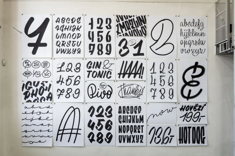
Typography is the tool I use the most because it has always impressed me how the shapes of letters can make a word acquire a personality and make it attractive. I like the strength of words, and typography can enhance their communicative quality in such a way that there can be as many possible meanings as designs.
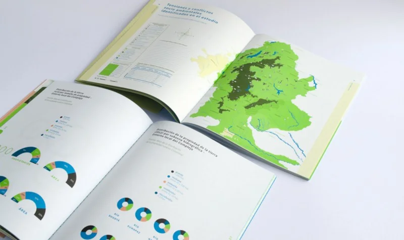
Book | Paramos
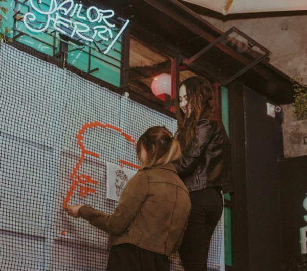
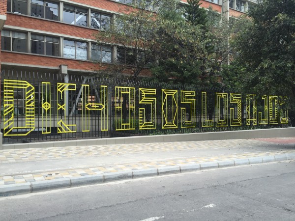
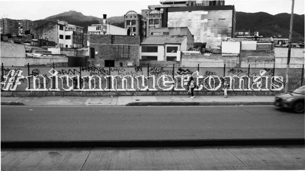
We can probably say that Type of Tape, co-created by Lully Duque, is all about type. It is a social project, as you write: ‘The main interest of Type of Tape is to highlight Colombian expressions that make people from other Colombian territories feel like they are at home. We want to remind them of their roots as they move around the city, expose our national culture and preserve our dialect and idiomatic expressions. The general message is to let all those people coming here know that they also belong in this city and contribute to our culture.’ What kind of response has your initiative received in Colombia so far, or maybe worldwide?
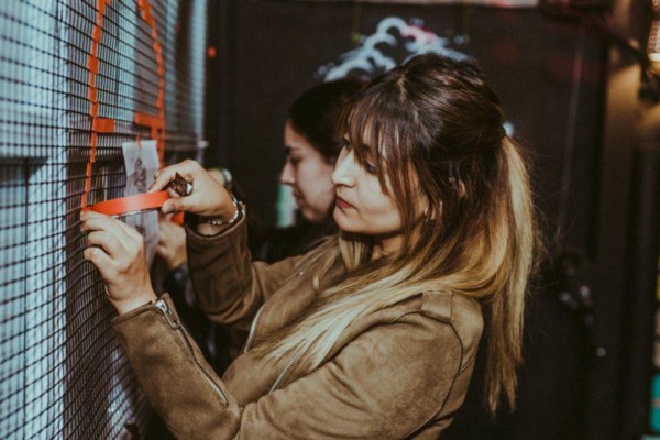
Language is a very powerful communicative tool and it comes naturally and directly to people. With Type of Tape, we use that tool to make people feel part of something, part of that phrase they see on the street; hence part of the place they live. The response has been very pleasant, it is lovely to see that people are smiling while they’re watching our interventions or taking pictures of them. For us, that’s already an achievement.
It is also a different way to make urban art. In our city, we are the only group that makes tape art and that has led us to attend festivals and events where we can see that people do appreciate the intention of communicating with typography on the streets.
I’m wondering if you think design is a great tool to do activism. How effective can it be to change society for the better?
I think design is the perfect tool. Many problems society has are due to the lack of communication. If we communicate more and better, certain problems could be reduced. Design is a medium that clearly communicates concrete messages so we can produce an impact on people, mobilize and even generate political and social changes through it.
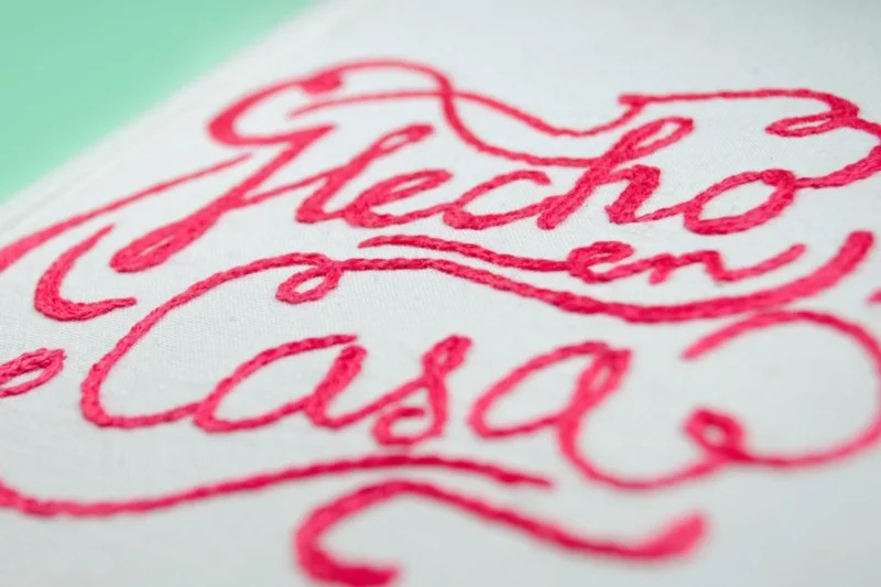
You do commercial as well as personal projects like Hecho en casa. How much does your approach differ when you work for a client or for yourself?
When I work for a client, I have to work according to their communicative interests and also meet their expectations. The aim in those cases is to precisely conceptualize the project and also conceptualize the clients — to see how they are and how they should communicate what they want to say. In my personal projects, I follow my own intuitions. I have certain objectives already set, and it is a job to investigate, build the information, and develop the project graphically. It is more exciting as I participate in the whole process and the results reflect what I am and what I want to say.
Hecho en casa
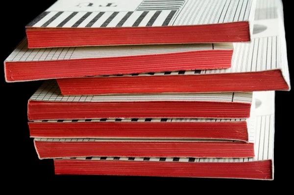
I’d say most of your designs come in colours, not TÚ y YO, though. Of course, the red has its moment. How did you develop the concept?
Tú y yo is a novel by Juan Cárdenas, a Colombian author. He developed the narrative inspired by Russian novels, where he cites authors who refer to the theories of Russian constructivism, and the novel is set in a Soviet prison. For these reasons, the graph corresponds to constructivism, where red is predominant. It was also printed in Linotype™ to highlight the workmanship that is spoken of in the novel.
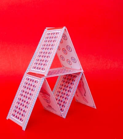
For your project Baraja española, you redesigned a pack of card. Please walk us through the design process.
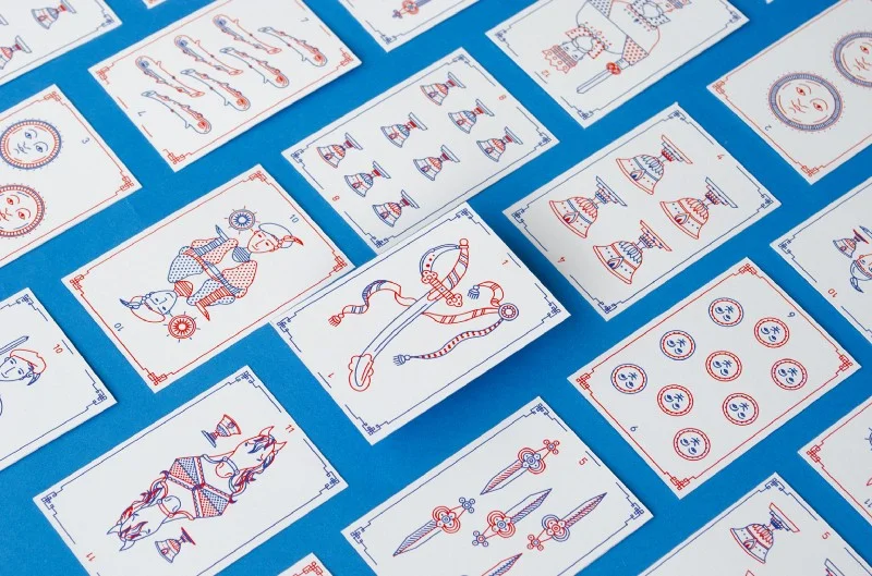
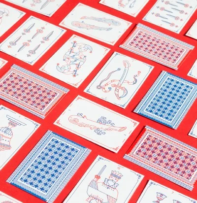
The redesign of the Spanish deck was born out of my personal interest. Every night my grandparents play Tute, a card game that can only be played with these cards. They also taught me how to play it, and to remember them I decided to redesign it. Although the original deck is indeed beautiful, I wanted to make my own interpretation. My process consisted mainly of decomposing the forms of the cards (which have four variants: Cups, Wands, Swords and Pentacles) and making them more geometric and young as well as simplifying them so that they were attractive and easy to read.
Why did you do the printing with Risograph?
Initially, the deck was designed in four inks but I made the decision to print it in Risograph because it was a cheaper and faster way to produce it.
You also do lettering, for example in your latest project HolaMona published on Behance. What do you like the most about lettering?
HolaMona represented many challenges for me: from its conceptualization and research to staging. It was such a personal project that I wanted to give a special uniqueness to it. I think lettering is perfect for this. What I like about lettering is its formal versatility that helps to give a character to what is said. That was what I was looking for in HolaMona. I needed to give a voice to texts without the need to use illustrations or another type of image. I wanted each piece to be special by itself and to come together in a harmonious way and be in dialogue with one another.
What would your dream project be?
The projects I like the most are those where I can learn something, and in which I have the liberty to propose things different from the conventional ones. In my dreams, I would like to design a book about the sky, because it is the thing that I like the most. I would like to learn about everything that is there above — about the cosmos, the planets, the stars, the clouds and the color!
What are you currently working?
I work in a design studio called Estudio Machete, where we develop mostly editorial projects. We are currently working on a book for the National Library of Colombia, a couple of books for Colombian artists, and we develop graphic materials for art exhibitions continuously.
And I constantly work on Type of Tape with my best friend, Lully Duque. We want this project to grow and become more known. Our dream is that Type of Tape helps us travel the world. As for my personal projects, I am investigating several things that interest me right now. However, as I told you before, these take more time because I have to discover what I want to say…
What are your plans?
I plan to continue learning. Always. I would also like to professionally study more about design. I’m planning to do more collaborative projects with talented artis
