On Design, Communities, and Gratitude
An Interview with Argentine Designer Florencia Gavilán
Vivid colours, quirky cartoon characters, analogue techniques, and loads of passion and devotion… Florencia Gavilán not only showcases her talent doing commissioned work on a daily basis but also shares her knowledge with students and people interested in learning about design in Argentina. I asked Florencia about her work, passions, and plans.
Florencia Gavilán
On your Doodle Addicts page, you write that you specialise in children’s illustration among others. So you make art for young souls and might even encourage them to become an artist themselves. How did you imagine yourself as an adult when you were a kid?
I think I couldn’t imagine myself as an adult when I was a child, and I can’t even do it today. While I have to do grown-up things, such as paying rent and taxes, I’ve got an idea of adulthood I’m not part of yet, and I may never be… I think people who save lives and construct buildings as part of their job are more grown-ups than someone who is dedicated to making drawings. Maybe that’s why I enjoy so much doing drawings for kids – because we share the same tastes.
You studied at the University of Buenos Aires (Universidad de Buenos Aires). How do you think the years spent there shaped you artistically and personally?
The university was everything to me. It gave me all the knowledge concerning my profession, and also a large number of wonderful and beautiful people to count the days with. Due to the fact that it’s free to study in Argentina, I could spend six years at university. We are among the few lucky ones in the world, and the quality is also great. (In terms of the arts and design, the university ranked 18th according to the QS World University Rankings in 2018.) During my graduation year and also the year after, I had the opportunity to become an auxiliary teacher there, regarding one of the courses I also had in the past as a student. There I kept learning from both my students and my co-workers. I believe I must clarify that the budget for public education is pretty low, and the majority of teachers work there for free. We keep working there because we feel proud of the university, and I believe in the importance of public education more than anything.
Please talk a bit about the characteristics of Argentine art, design, and culture.
There are many super talented people in the world of design and illustration. An illustrator degree is something that doesn’t exist as such here, at least as part of the public education system. So the majority of people take shorter and longer courses or attend workshops outside the formal education system. Therefore, a somewhat niche but varied, wide and independent circuit has been formed by us working with illustration, and we all meet and help each other regularly. For example, it’s normal for us to have a fanzine fair organised, or somebody’s exhibition where we gather together and have a good time – and then eat pizza.
Design is usually less or more appreciated by clients in particular countries. What about Argentina?
Designers are less appreciated here as well, and not only by clients. We live in a society where no one would doubt how much to pay a lawyer or an accountant, but one would definitely doubt how much a designer should be paid for their services, as it is believed that ‘anyone can do it’. In addition to that, many of the big design studios with offices in Argentina tend to hire recent graduates full-time and pay them the minimum wage, which is very low. They would also say to them that they would receive recognition and exposure. And despite working full-time, they are hired as independent contractors. I think this is worse than our work not being appreciated by clients.
What position do you think Argentine design holds in the context of South America, in the Americas, and in the world?
Against all odds, I think Argentina is well-positioned worldwide. Just to add some historical context, I would like to talk about Tomás Maldonado, who recently passed away. Between 1954 and 1967, he was the director of the Ulm School of Design (Hochschule für Gestaltung Ulm), which is a successor of the Bauhaus, a place where the bases of modern design were set. And already at that time, he imported that design tradition and implemented it in our education here in Argentina. That is to say, design here in Argentina, while still young, was constructed on very solid bases. Thanks to teachers and professionals, design readapted itself, using that legacy as a starting point.
What are the challenges and opportunities designers in the region have?
Designers have the same challenges and opportunities as any other professionals in Argentina would have. I mean, while education is free, it’s not the only relevant factor. For some, to be able to work properly, many materials are needed – and you can only buy those if you have a paid job. However, if you work nine hours a day and receive only the minimum wage, you probably don’t have so much time to further develop your personal style. And even though we sacrifice our time and money, we should still consider us lucky for having the opportunity to do so, and we have to be thankful for that.
You seem to doodle a lot in your sketchbook and have also participated in doodle challenges on Doodle Addicts. So I’d like to learn more about the process you follow when designing, illustrating, etc. Guide us through the design process!
An important part of the process actually begins right before the sketching itself. I’m surrounded by images such as illustrations, photographs, flyers, things that I can see on screen, at work, etc. And all the things I see and like, I select them and save them for later. I save everything I would like to try, such as colours, a pose, a character, or a perspective of some kind. Whatever I like, no matter what it is. And the excuse for using them appears randomly. With the Doodle Addicts challenges, they propose a theme for the drawing, for example. So I’ve already got the important part of the process, namely the theme/subject. After that, I ponder on an idea, go back to my backup images and think about which colours I feel like trying or what technique could be more suitable for what I want to tell with my illustration. All aspects of the artwork are part of a process in which I make every decision to better understand the idea.
When someone looks at your work, they can see a palette of colours and maybe even styles. How do you decide whether you should go for a black-and-white piece or one with three or more colours?
That depends pretty much on the topic I’m working on. I think there are topics that deserve less use of colours so as to generate more contrast, gravity or any sensation you feel those colours embody. Speaking of design in particular, if I want to create something more punk or more corporate, I would use black, white, and perhaps a few colours, but not many. In both cases, even if they are in fact kind of the opposite. On the other hand, for projects that are not so attached to any particular style, you can use as many colours as you wish, given that you can have other different factors defining the aesthetic you are looking for. This can be seen mostly in the case of illustrations or personal projects, where you don’t have to follow every rule.
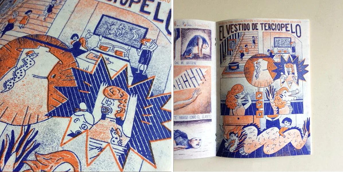
Tell us about your contribution, called El vestido de terciopelo, to the Sudaca magazine.
This was a wonderful project. A friend of mine invited other illustrator friends and me to participate in it. The magazine was made for the third Almirante Brown Book Fair we attended as a collective of artists and illustrators. Given that it was a literary fair and we are illustrators, so we’re not from the world of words but images, we thought we could make a fanzine in which every participant would reproduce a Latin American story as if it was a one-page comic. The expression ‘sudaca’ is a derogatory way of referring to people living in the south of the continent, and at the same time to the majority of the population living in the southern region of the Buenos Aires Province. So the name is an ironic joke itself and has a double meaning when talking about our geographical location, the reason why we know each other in the first place. Another friend of ours from the neighbourhood printed the magazine with Risograph, and we presented and sold it during the event.
You’ve worked on projects related to social, societal and political issues. For example, you designed the poster and created a video for an event discussing the future of society. In addition to this, you also came up with your version of some film credits. Of which project of yours are you the proudest, and why?
They are school projects, and I’m equally proud of them. The film credits were my first experiments with animation, and I worked on them together with my boyfriend, who was only a classmate at that time. We really enjoyed making them, and I would say, we got a great result we both felt proud of. The poster and the animation of the International Forum, I designed a few years later. By that time, I was more experienced in the field of design, so I was able to add a more personal style and a more specific tone to the graphic system that I was to develop.
Related to the previous question, do you think design is a great tool to do activism? How effective can it be to raise awareness or change society for the better?
Of course! Design can be a very strong communication weapon. For example, I was able to use my knowledge of design regarding feminist actions. In the last years in Argentina, a feminist wave appeared, and it continued to grow massively. Three years ago, I made a poster under the slogan ‘Vivas Nos Queremos’ (We Want Us Alive), a phrase that comes from a group of women activists from Argentina. The artwork ended up travelling all around the country and even other places on other continents. It raises our voice, ‘to protest against femicide, transvesticide, domestic violence, rape, the day to day street harassment and so many other forms of patriarchal oppression and violence’, and embodies the shout of many women. Even to this day, I keep receiving photos of street art, pins, and stickers with my image. On a smaller scale, the same happened with the legalisation of abortion. Abortion is still illegal in Argentina. A few months ago, the bill was taken to Congress, and many illustrators and graphic designers accompanied the campaign with their artworks. While there is still very much to do in terms of equal rights in our country, I think these kinds of tools give good visibility to these issues and make them accessible to all kinds of people.
You seem to like techniques such as screen printing and woodcut a lot. Why do you like working with these so much?
The implementation of these techniques interests me. I like working with these techniques because of the texture and the impression created, which are pretty difficult to recreate entirely by computer – at least for me. I usually sketch in an analogue way and then compose digitally. Two particular characteristics strike me as visually interesting. The first one is the overlay of colours: when working with woodcut, I have to use separate wooden blocks for each colour, and then you get the third one by overlaying the two inks. The second one is the composition/synthesis. Given that you are working with rough materials such as wood, it’s almost a necessity to sacrifice a few details to go for something ‘simpler’. However, that doesn’t mean the process will be easier. It may be also done digitally, but I do think both characteristics give the images very special power. I also like the fact that these techniques don’t have the perfection or accuracy that can be reached by some other techniques. In this case, the errors are always present (spots, not exact overlays, etc.). And it is when we take advantage of these errors, we get an interesting and different result. This has always seemed enriching to me.
You teach and also organise workshops using these techniques. What has your experience as an educator been like so far?
It wasn’t so long ago when I discovered how grateful it is to teach. I grew up in a family full of educators, so my primary objective was to do something different, and I partially succeeded. Yet when I had the opportunity to teach (at the university), I took it and it felt wonderful. I learnt a lot from my students, and I think I could really identify with them. I learnt again all that I had already learnt before, and I was finally able to figure out what my teachers were expecting from me, and got to know why they made the corrections they made. Of course not all of them, but many. At the end of the year, I always thank my students for attending my classes and listening to me. I think it is important to do so. They also thank me for what I taught them, and a connection is established between us. We could all share a sense of gratitude and uniqueness.
Regarding the workshops, those are for a more specific yet diverse audience. People of different ages and professions come from different places, and every one of them has a unique reason to learn what I have to teach them. So they use their knowledge learnt in many different ways, and this leads to a wide range of final outcomes. Many times I actually felt that they were doing things I never taught them. And it was great because it meant they were using the techniques in their own way – by also teaching me at the same time.
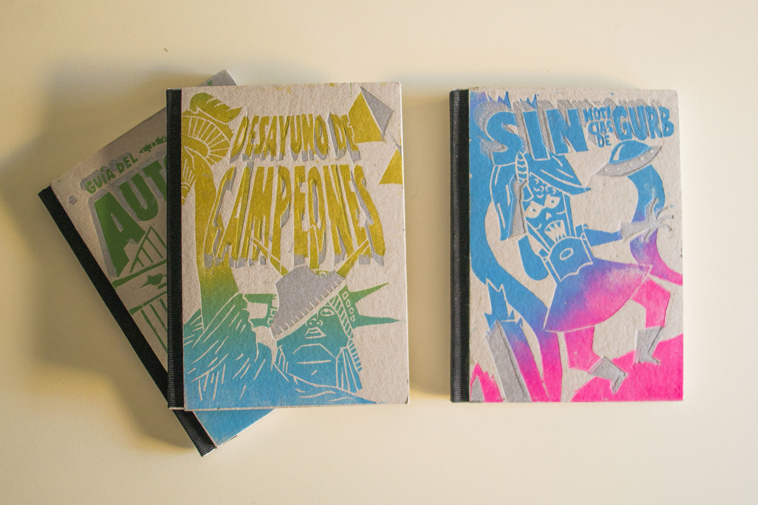
You offer your services to clients working with the arts, theatre, music, literature, etc. Tell us more about the book Libros de Ciencia Ficción and the one on Vivienne Westwood. How did you develop the concepts?
These are also university projects. In the case of the science fiction books, my idea was to copy the style of Z-movies and apply that to the worlds of books. It is three absurd and kind of bizarre science fiction books. I made woodcuts for the covers and printed onto grey paperboard (similar to the paperboard of a box of pizza) and the interior was made of newspaper paper (also grey and pretty cheap). The images were printed with metallic and FLUO inks so that I could combine the elements, the cheap aspect of the book with science fiction.
The concept behind the Vivienne Westwood editorial was to discuss some parts of her origin story. These days she is a top fashion designer but she started out designing clothes for the Sex Pistols and forging the punk aesthetic, as we know it. It was the philosophy behind all this, namely the ‘Do It Yourself’ that caught my attention the most. So my intention was to design the editorial as some kind of fanzine, made of home-made photocopies, to capture the essence of the ‘Do It Yourself’ and the generation that wanted to remain outside the system.
What are you working on right now?
I’m working on a project that really excites me because it is about the design of a CD cover. When I decided to study graphic design, it was my dream to design and illustrate CD covers, given that I always felt very close to the music world. When MP3s appeared, I realized CDs had an expiration date – or at least the industry was going to have rough times and partially die. Luckily, I found other really interesting types of design jobs. But now I have the opportunity to design a CD cover once again! A few years ago I designed one for some friends I used to play music with for two years. It was a pretty special experience for me. But it is different now, as someone contacted me to design their CD cover in my personal style. It feels great that they trust my work, and I will deliver my best.
What are your plans?
I’d like to visit and spend some time in Melbourne, Australia. I’ve already got my Work and Holiday Visa, and if everything turns out great, I’ll be there for a year travelling and working. I may even extend it, if possible. I don’t have concrete plans, but I aim at doing what I love. (So, if any Australian reading this, please, feel free to contact me regarding any work opportunity.) In addition to that, I also want to experience what people on a VISA usually do there, working at a farm for a few months, for example.
Let’s finish off with a bonus question. What does that black cat symbolise?
Haha, nothing in particular… I love cats! In theory, the black cat means bad luck, but I think no cats deserve that infamy, so I would say it is a ‘good luck black cat’.


