‘You Shouldn’t Be Afraid Of Failure’
An Interview with Argentine Graphic Designer Julia Miceli Pitta
Based between Buenos Aires and London, Julia Miceli Pitta showcases her work through different media while constantly exploring new worlds. What caught my eye is a visual identity commissioned by a film festival, but soon I discovered that Julia’s portfolio includes a variety of projects demonstrating her diverse skill set as a graphic designer. Throughout the years, Julia has experimented with type design and taken the role of a photographer in addition to her jobs done in the realm of graphic design. I asked Julia about her work, Argentine design, becoming a teacher and many more…
Julia Miceli Pitta
Unfortunately, we still can’t really see the end of the pandemic, so I’d like to ask you about your well-being first. How are you?
Thank you for asking. I’m good. The beginning of the year has been a bit complicated, but I think we are finally seeing the light at the end of the tunnel.
Glad to hear! Now I would like to go back in time a bit and ask you about how it all started. Examining your website and online presence, it’s pretty clear what you aim to do as a designer. When and how did you realise that design was the right path for you?
I’ve always been interested in culture. Art, architecture, design, dance, museums, travelling, meeting new people… I think design is a way of bringing together all the worlds that I like to be immersed in one place. I found out that my career is a medium of exploring new worlds and I love it.
You not only studied at the University of Buenos Aires but later also joined the staff as a teaching professor. How did your views on design and typography change after this transition, if at all?
They definitely changed. The interesting thing is that in both cases I was learning but from a different perspective. When I was a student, I was more focused on experimenting for no reason because the projects weren’t ‘real’. Later, when I transitioned to a teaching professor, I discovered that this way of thinking was wrong. The projects are real: it doesn’t matter if they are for a client or not.
You say that your ‘aim is to encourage students to think critically, develop their own voice and experiment fearlessly’. Your second point got me thinking because we are surrounded by so much content – be it visual or not. Considering this, how (easily) can someone develop a unique style?
It is not easy at all. You shouldn’t be afraid of failure… I don’t know why most people are afraid of it. It’s the only thing that makes them grow. We all make good, bad, interesting, boring decisions… That’s life. The only way to develop a unique voice is to follow your curiosity, not what you find as a reference. But again, if you’re afraid of failure, it won’t happen. In failure you may find some interesting decisions that encourage you to keep pushing and investigating that particularity.
You are based between Buenos Aires and London and have travelled a lot as a designer, so you must have been exposed to different approaches to design. What is something that is peculiar to Argentine design and/or designers?
Argentina has many AMAZING artists and designers and I think they all have one thing in common: perseverance. Argentina is a tough country. If you want to live there, doing what you love, it’s tough. Most of the artists and designers that come to mind work very hard and that is why they stand out beyond their own styles.
You also travelled to China in 2018 and were in charge of the printing production of several projects. What are the dearest memories of that time? How did that trip influence you and your design practice?
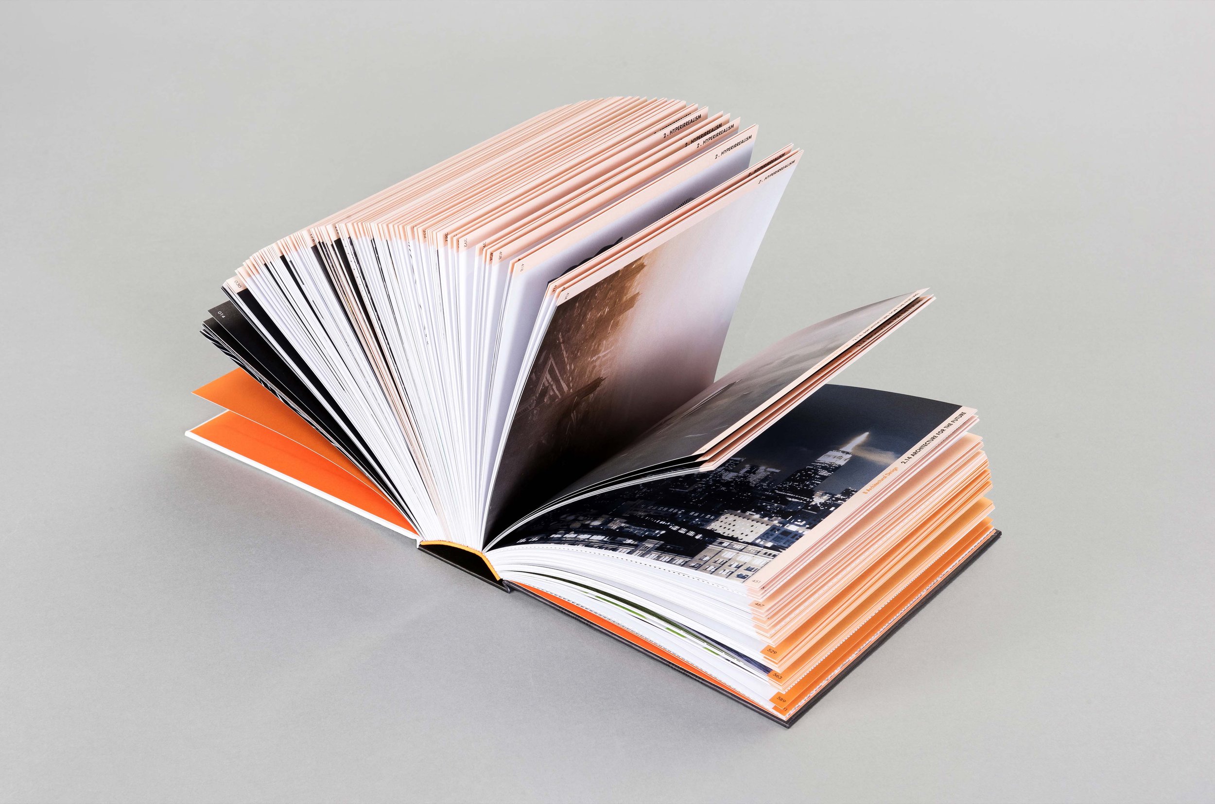
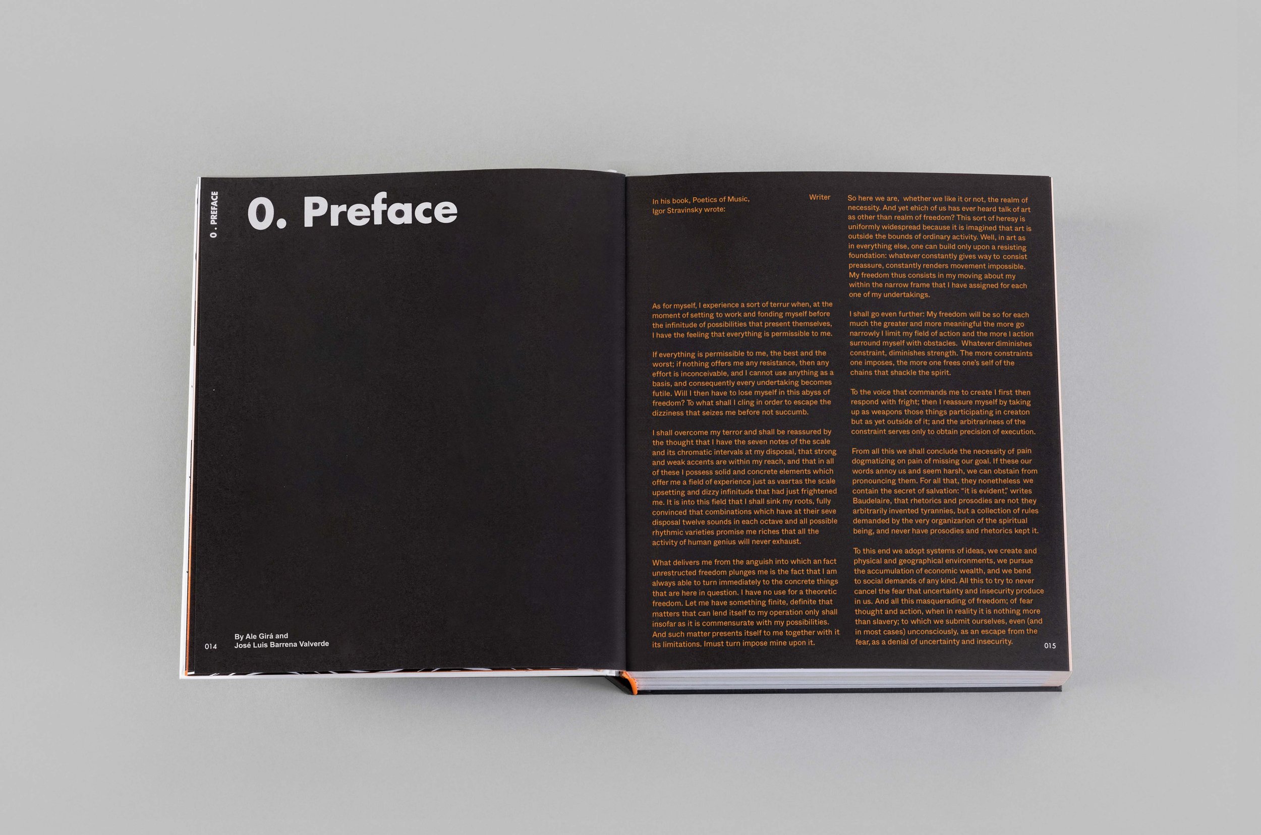
It was an amazing trip. At the time I was working for a book publisher and that experience changed my mind. First of all, I learned all about print production: pre-press, press, materials, machines, timing… The whole HUGE process of printing a book. After that, I wasn’t just designing a book in InDesign any more, I was thinking about foils, bindings, papers. On top of all the technicalities, many of the people who work in China don’t speak English. We both had to find a way to communicate.
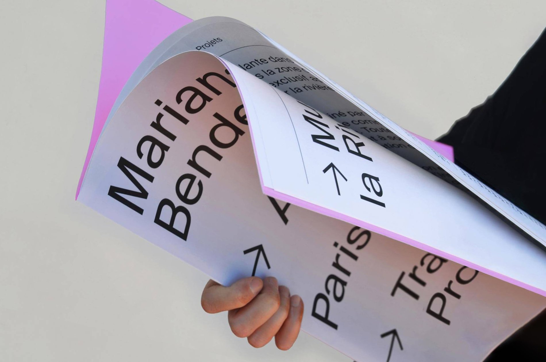
You specialise in visual identity, editorial design and creative direction, and have worked a lot with clients from the cultural sector. You have briefly touched upon this at the beginning of the interview, but I would like to hear more about your interest in this field.
Working with clients in the world of culture was not something that happened spontaneously, I looked for it. I’m interested in people and their cultures. As a designer, every project makes me get inside the other person’s head and that’s one of the most interesting things in my career. Working with artists, architects, photographers makes me constantly ask them questions and learn about their practice.
Speaking of clients, how do you decide which commission to accept or decline?
Easy. I need someone who cares, someone who wants something more than a design: an idea, a concept. I’m not interested in just delivering a design. I’m looking for more. If I can’t find that curiosity, it means we are looking for different things.
In addition to your career in design, you’ve gained experience as a freelance photographer with a keen interest in architecture. You’ve designed visual identities for architects, too. Why architecture?
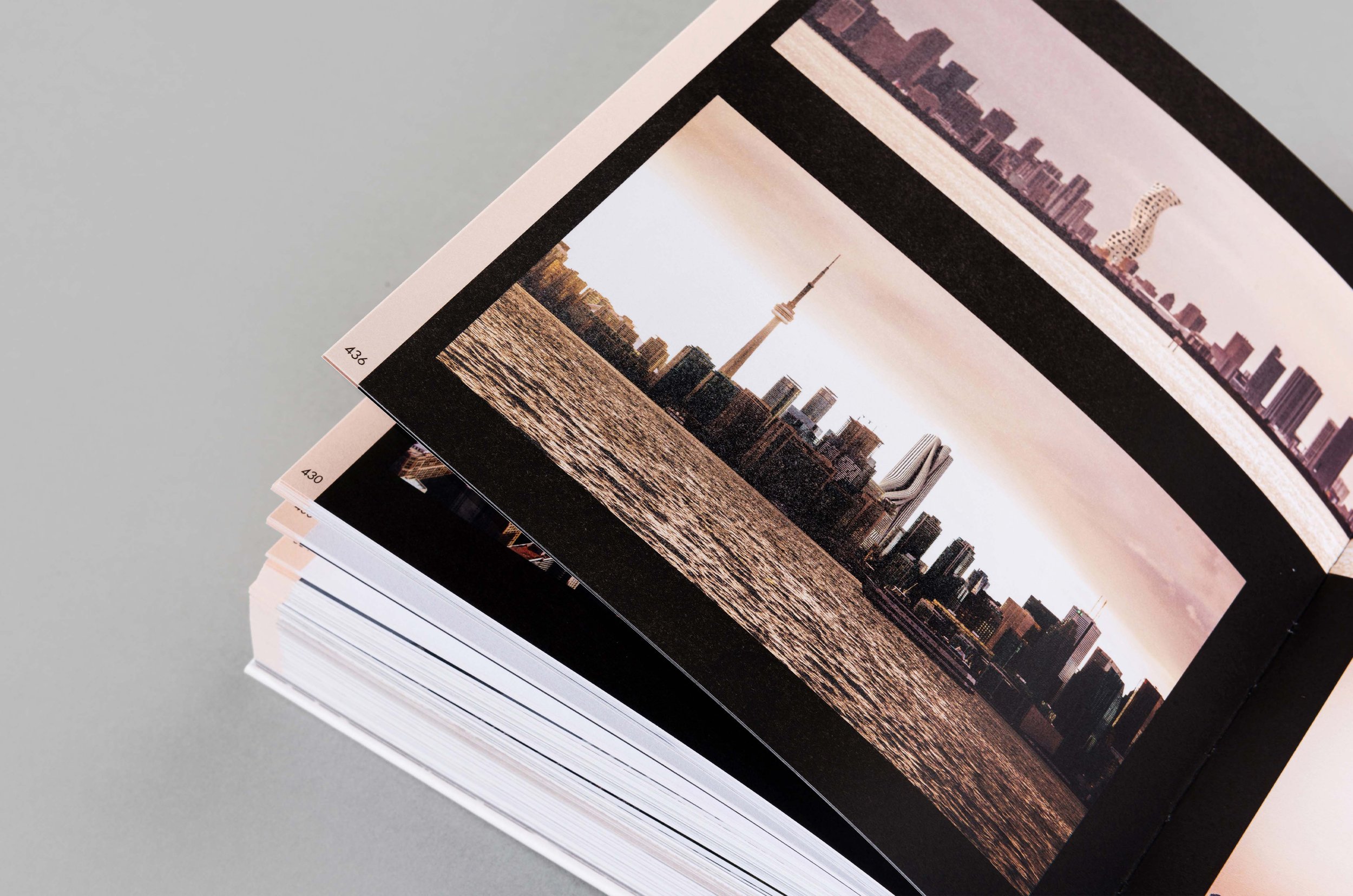
I’ve always been interested in geometries, textures, not buildings. I think my focus as a photographer is to capture the geometry and visual weights that the building generates. Besides the formalities, behind every building, there is a concept. An idea. And that’s what makes me want to work with architects.
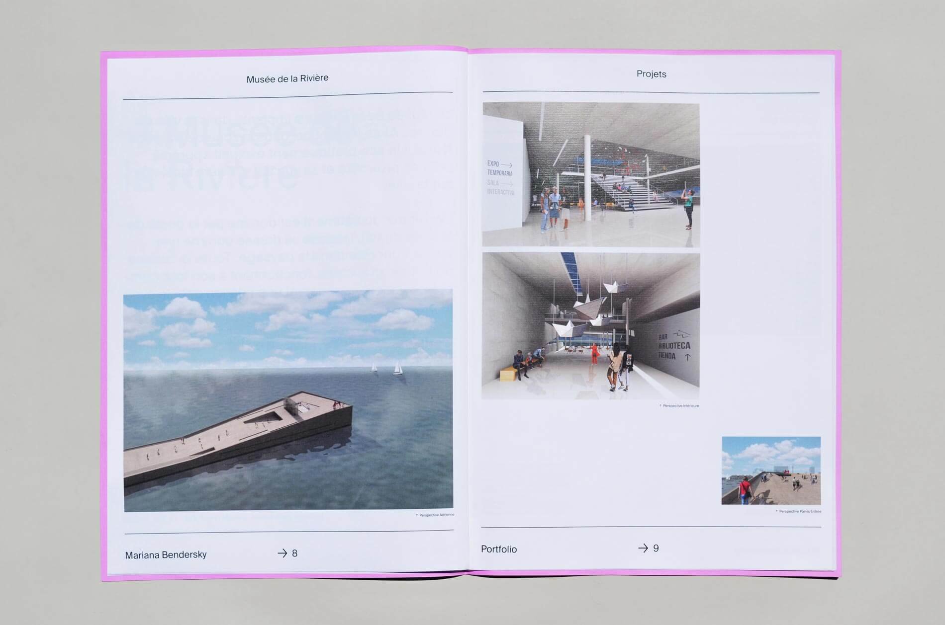
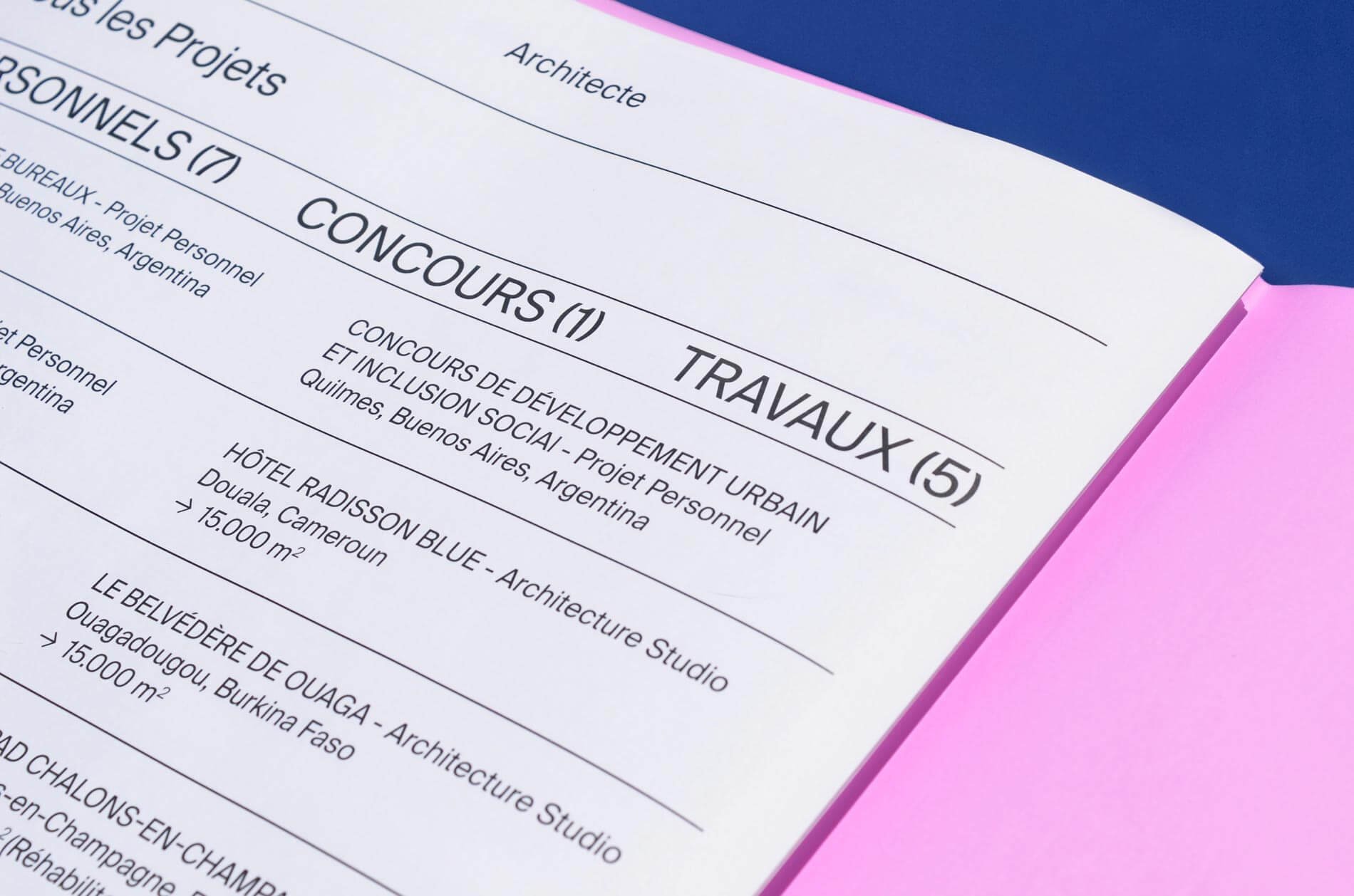
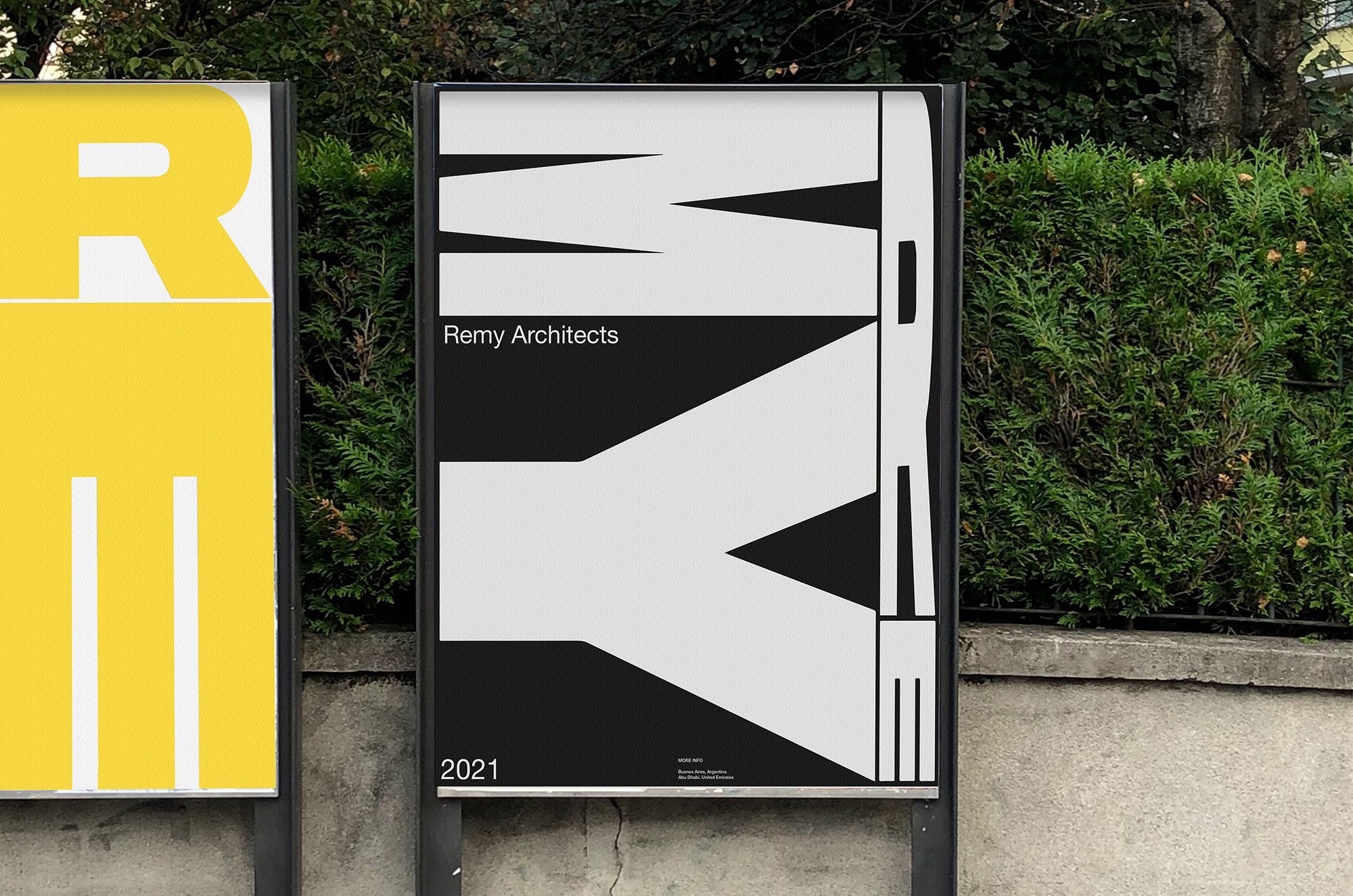
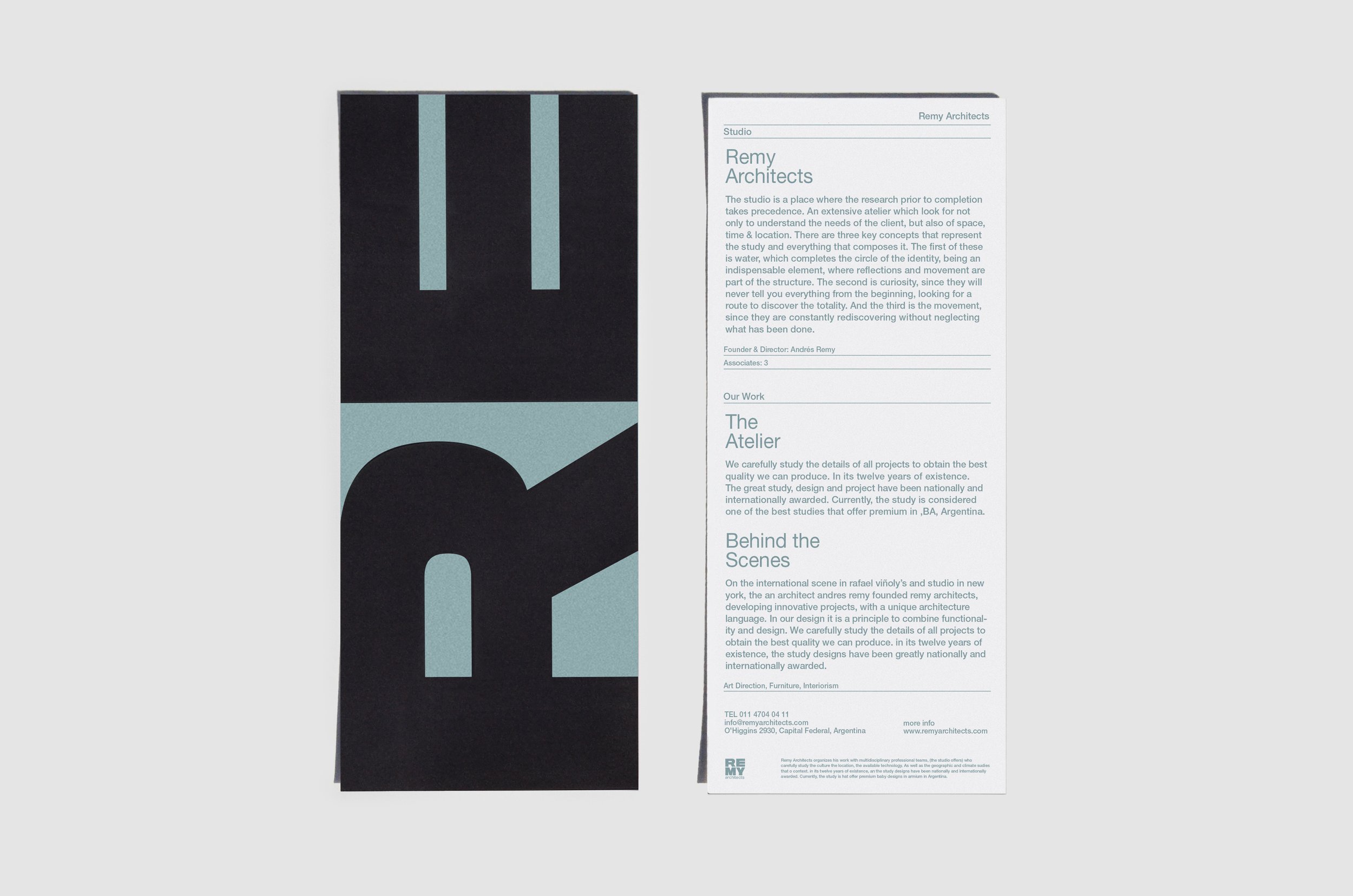
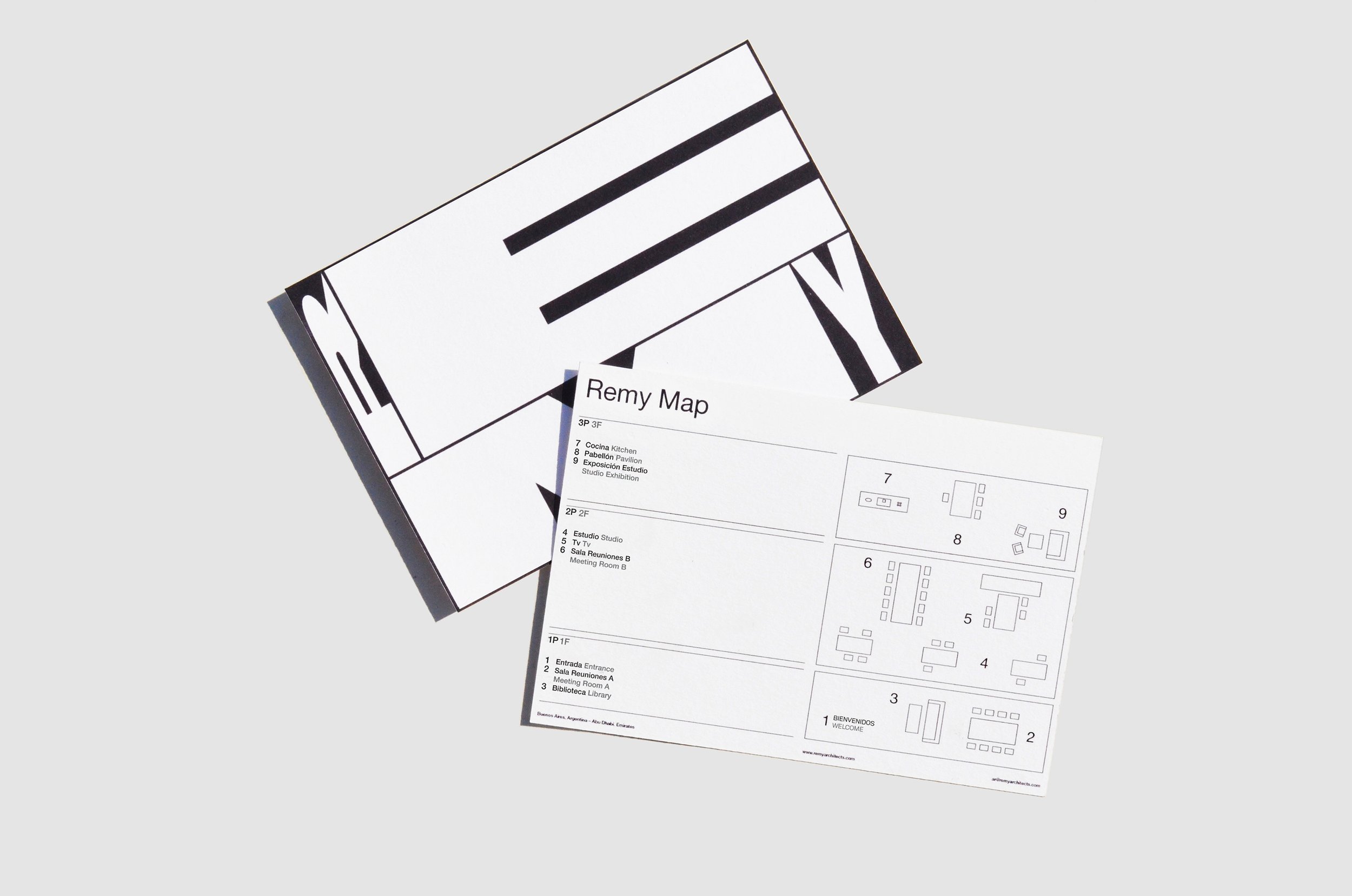
The project for Remy Architects includes both static and animated elements. Motion graphics seem to enjoy a lot of popularity at the moment. Would you like to explore that area more in the future or do you still prefer static design considering your passion for editorial design?
I’d love to continue exploring motion design as well as other practices. I believe that the important thing is to find what to say, not only the medium.
Typography plays an essential role in graphic design, especially in editorial design. How do you usually choose the typeface for a particular project?
I’m always on the hunt for new fonts. Sometimes I stop on the street and take pictures of some fonts I like and then look them up, other times I contact font creators to find out more about their new releases. I have been creating my own suitcase of fonts and when I start a new project I tend to think about its details and background, I end up understanding which of them might be the most appropriate to use.
Type design is an exciting field. You also list it among your services and present the type design project ‘Numbers Exploration’ on your website. What do you find the most fascinating about type design?
Type design is an extraordinary way to not only reflect current design, but also to link it to other times in life. I always tend to ask myself: If this typeface were a person, who would it be? If it were a publication, what would it be?
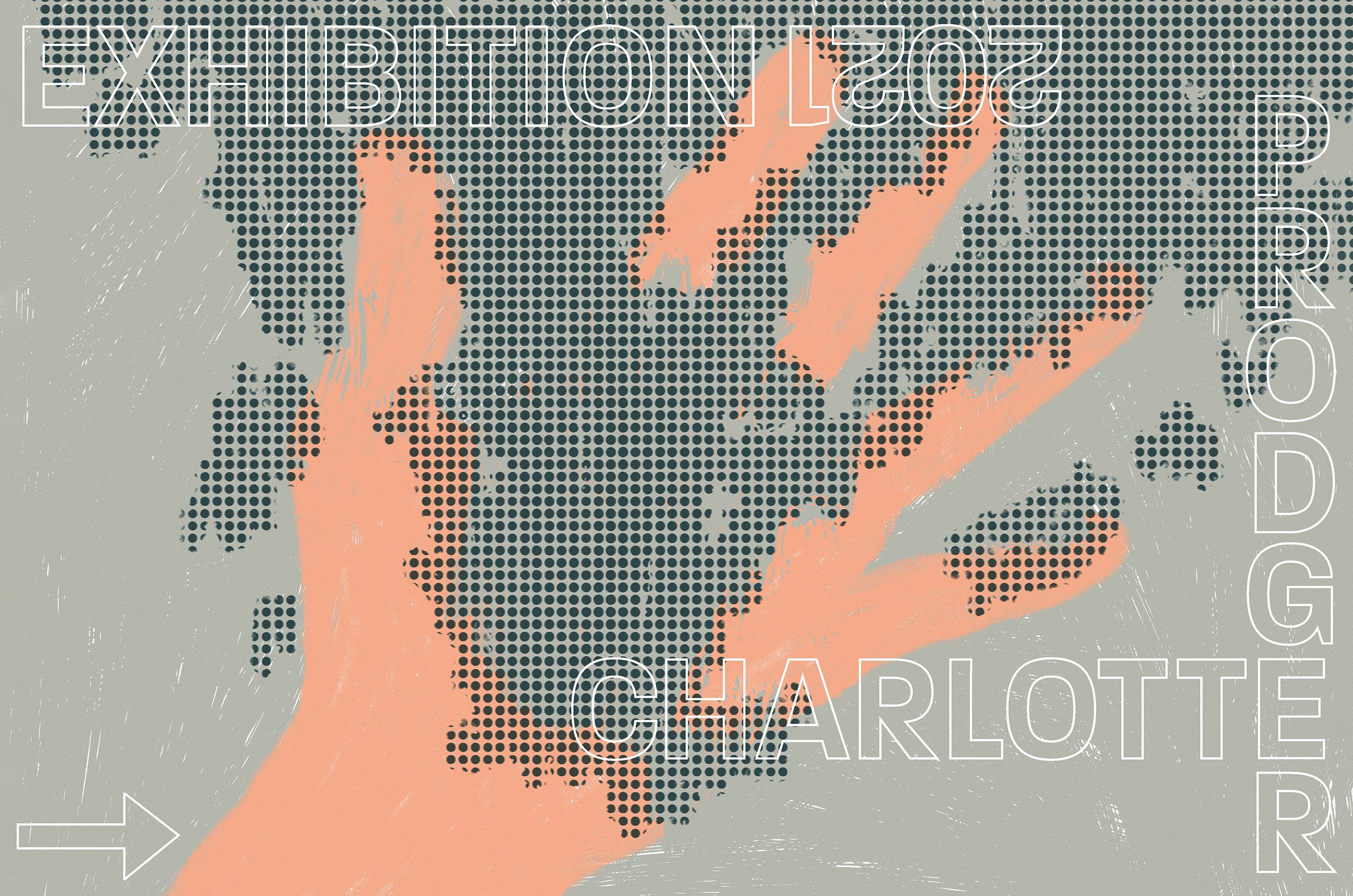
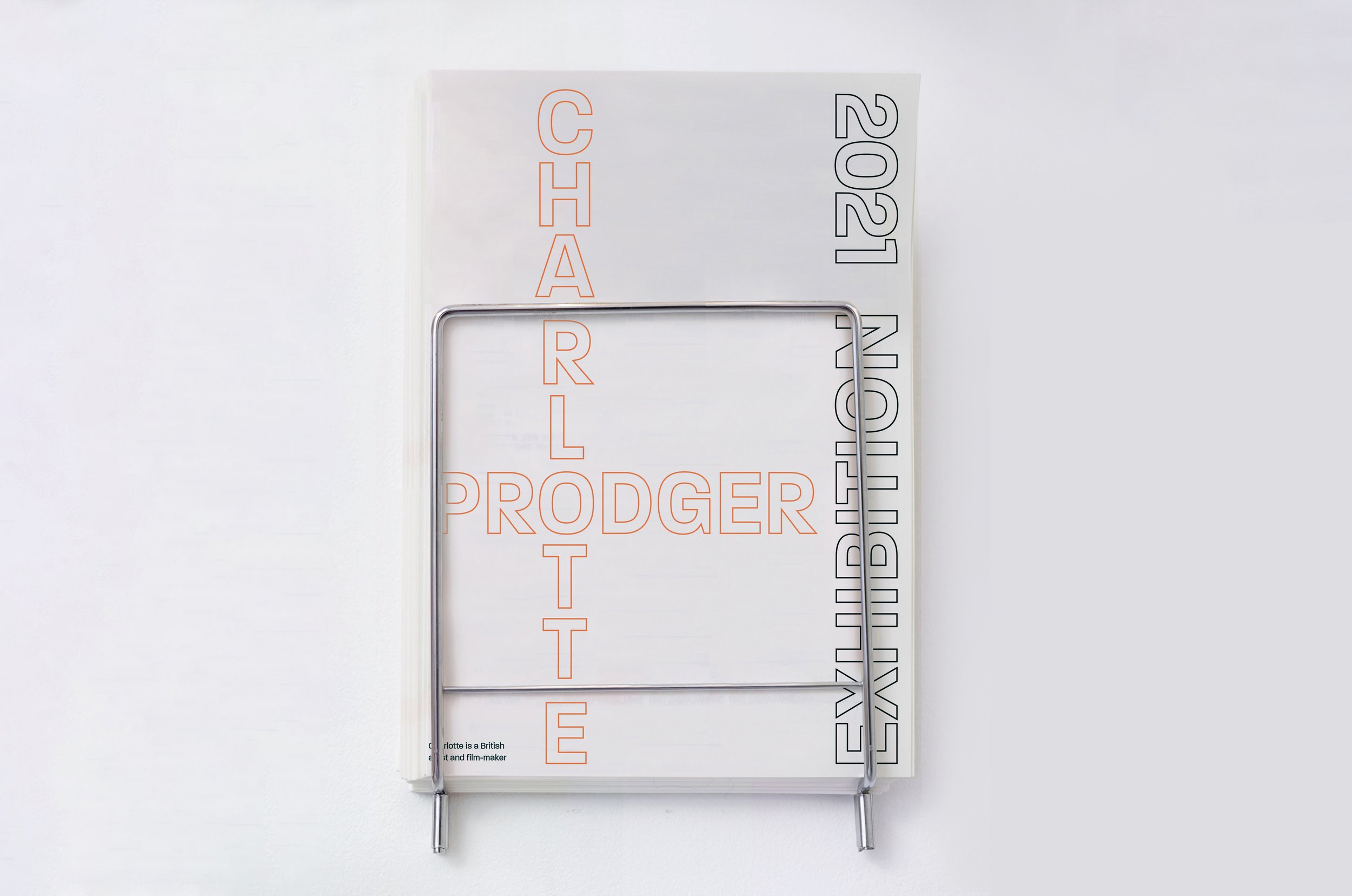
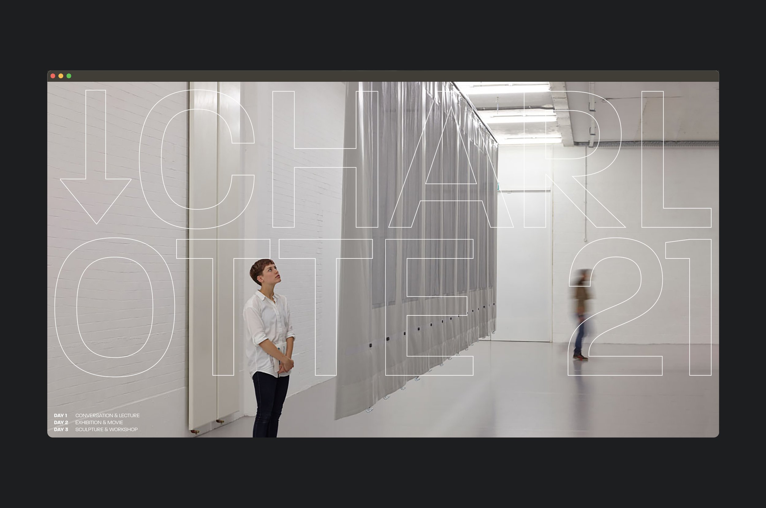
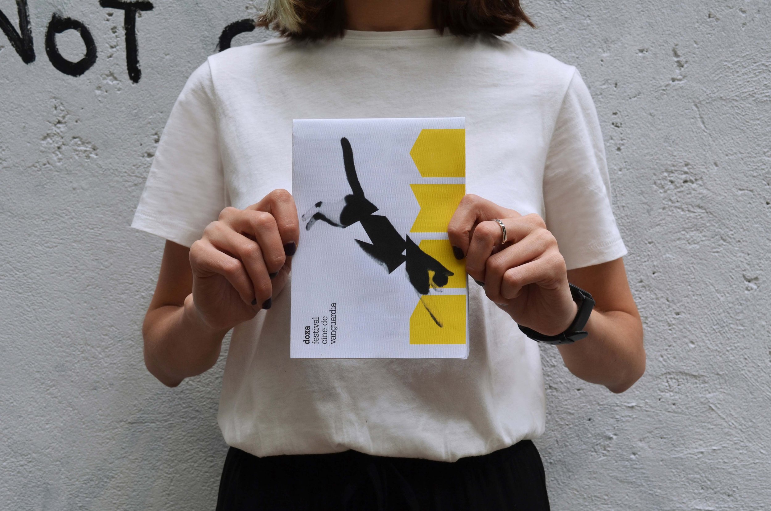
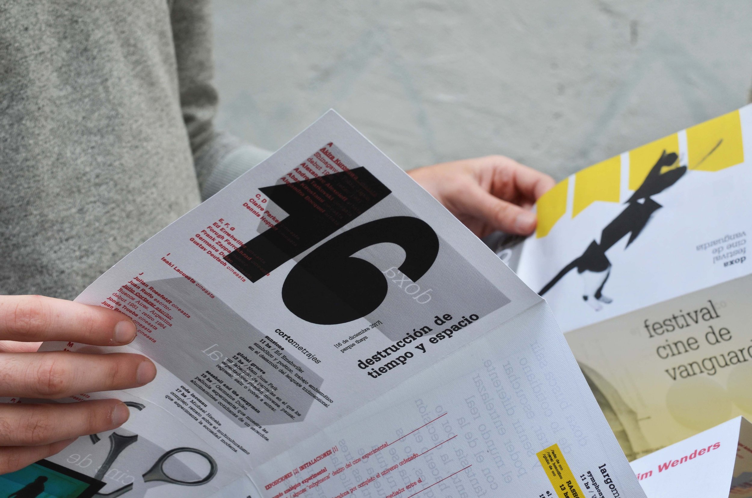
As a person with a passion for cinema and an interest in film festivals, I must ask you about the film festival identity developed for the DOXA Festival. Please tell us about how the project came about and how you worked on it.
The DOXA festival is a three-day film event that took place in different spots in the city of Buenos Aires. The festival was installed in several sites, which offered the opportunity for attendees to see a list of well-selected films in a unique and unforgettable setting. The directors contacted me to develop not only a visual identity focused on avant-garde cinema but also to think about the films and exhibitions that were part of it. It was an incredible experience because I started to get more involved with this type of cinema. In addition, I used some characters and subtle decisions linked to some films that were presented at the festival.
Looking at your projects, I’d say you boldly embrace white space in your work and tend to avoid using too many colours. Would you say that these are accurate observations?
Yes! Completely. Somehow I always try to highlight what I’m trying to communicate. It can be a phrase, a photo, or an illustration. Do not overload the space with too many decisions. Otherwise, I feel like I’m just making a good design without a concept or idea behind it.
On your website, you write that for you ‘to learn and understand rules is essential, but daring to break them is equally important’. Thinking of the conversations discussing gatekeeping, representation and diversity in almost every field, how do you think our approach to universal (western?) rules in design has changed or is about to change?
They constantly change. It’s interesting because a couple of years ago many designers followed formulas or styles. The Swiss rules, for example. With this type of design, we have everything under control, sizes, fonts, spaces. Today, most designers have all that information in their brains, but they are constantly striving to go off the grid and try new things without being too strict.
What are some of the questions you think the design community worldwide should discuss?
I think the first thing that comes to mind is already happening. This pandemic showed us that collaboration between countries is possible. I would love to see more interdisciplinary work between studios and freelancers around the world. The design community should discuss different approaches to this working methodology, instead of getting stuck with what we already know, which is basically living in a country, working in that country.
You’ve showcased your work and talent as part of multiple exhibitions, publications and contests. You’ve also been selected to participate and share your work with renowned designer Jessica Walsh. Not to mention that you’ve been featured on Behance.net several times. Many designers, and people in general, would consider these great successes. What does success mean to you?
Success means the possibility of learning, exploring and discovering new worlds, people, cities, through design. Nowadays, I feel very successful because I’m meeting amazing people who are interested in sharing their way of thinking and creating. Awards and mentions are something nice but the experiences are what are worth the most. Those are the ones that change your way of thinking.
We can really say that you’ve built a successful freelance career. What advice would you give to others who are about to embark on their freelance journey?
Find what you love, and let it kill you.
What are you working on right now?
I’m working on very diverse projects. I’m creating a brand identity for an art and performance centre in New York, where the three directors encourage me to create without limits. I’m also working with a fashion designer with a great knowledge of fashion technology. We are very close to launching her brand in Barcelona, which is focused on reshaping the way we think about fashion with garments without sizes. I’m also working with a London studio on various identities and editorial designs.
Any plans for the near or far future?
Keep travelling and working. Have the opportunity to collaborate with as many people and studios as I can. Understand their cultures and their way of working. In the distant future I want to go back to school.
The interview was done at the beginning of 2022.


