‘It’s Never Easy to Impose Ideas’
An Interview with Mexican Design Studio Anagrama
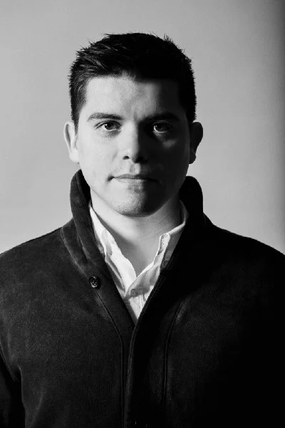
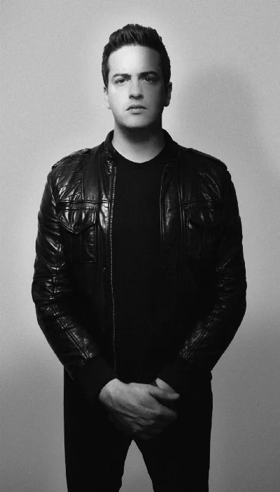
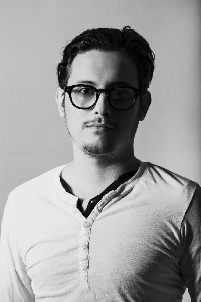
Anagrama founded by Gustavo Muñoz, Sebastian Padilla and Mike Herrera in the northern Mexican city of Monterrey in 2009 is probably one of the most successful design studios on the planet. However, despite all their success, they have never stopped wanting to become even better. They approach all their projects in the same manner, with the same eagerness, and are always up for a new challenge. I’ve asked them about the past, present and future.
Today Anagrama is among the most well-known design studios in the world, but how does it all start?
Mike and Sebastian met when they worked together as junior designers in -101 and they later teamed up with engineer Gustavo Muñoz, who had a solid background in business and web development. The idea was to break the traditional creative agency scheme, integrating multidisciplinary teams of creative and business experts. In the beginning, they worked out of a tiny spare bedroom in Gustavo’s house. Thanks to the great success of the Theurel & Thomas branding in the international design community, work started coming in droves and the team started to grow.
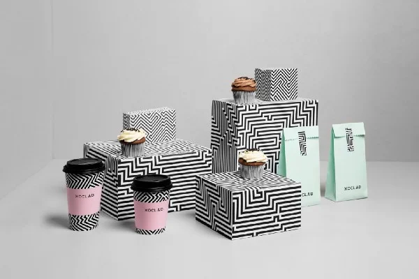
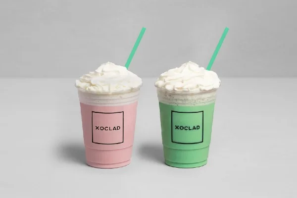
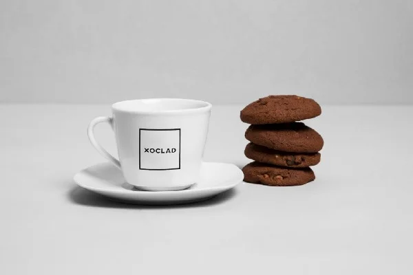
Xoclad
You’ve executed a large number of projects commissioned by a great variety of clients. How would you describe your style?
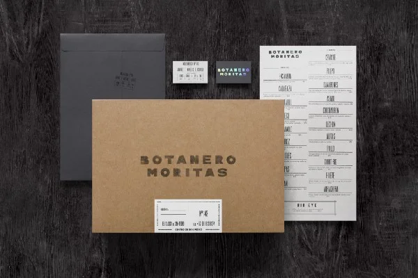
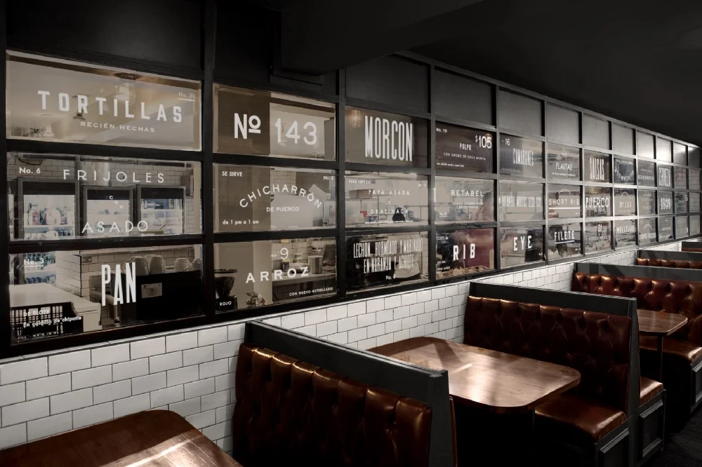
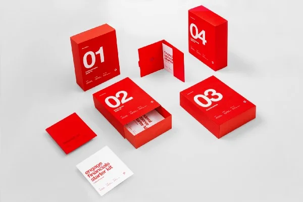
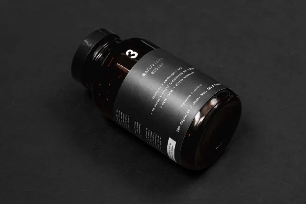
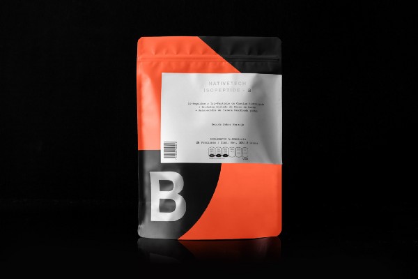
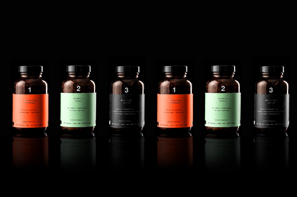
Anagrama’s visual style always relies on a strong concept. Sometimes that concept is a collision of two very separate ideas that together give birth to something very interesting and unique. Our style is always crafted with a careful eye for detail, with Swiss design in mind, keeping it very neat, clean and honest.
I assume it feels very good to be well respected and acknowledged, but I’m wondering, if this puts any pressure on you.
Totally. Taking care about the creativity and the ideas that come out from the studio is an everyday job. Every time we find ourselves working on a project we ask these questions: Could this transcend? Would it be something that you would admire if you saw it in books or on design blogs? If both answers were yes, we are on the right path. And even though it exists a pressure to take care of the portfolio and the contents of our projects, the most important thing is to never stop enjoying and being passionate about what we do.
On your Behance profile, you give a fairly detailed project description. How important do you think it is to use social media or other (portfolio) sites to promote one’s work?
Very important. The diffusion of our work exists thanks to our online portfolio and platforms like Behance. In our experience, it is the best way to show our creative talent through an impeccable and well-cured documentation.
Being a journalist, I mostly hear about Mexico in the news when a(nother) journalist is killed. Despite that, I imagine Mexico being a lively, colourful and diverse country. What should we all know about Mexican design?
Like everything else, the media always shows (almost every time) the worst part of things. Mexico is a beautiful country, with lots of contrasts. It’s a country full of history, culture and talent. Design in Mexico, like in other cities of the world, gaining a lot of strength. This is thanks to other creative industries such as cinematography and gastronomy that had stood out internationally.
What position do you think Mexican design holds in the context of Central and South America and in the world?
We like to think that our design is not Mexican, but international. It can be Mexican or European, North American, Japanese, etc. In the creative industry, you can’t rely on a single design style. It’s important to be aware of what’s happening in the world — to travel, to know other cultures. This makes the ideas flow farther than the border of the country you were born in. That’s why this is a difficult question. Today Latin America is going forward with a lot of power — more than ever — in the creative industry.
You state on your website and have mentioned in several interviews that you always do intense research regarding the company’s environment, objectives, values, conceptual principles, its personality, association systems and conceptual structure. I wonder how difficult it is to convince your potential clients that it is necessary to create something unique and peculiar in order to be able to stand out. Do they easily share the information you need with you?
It’s never easy to impose ideas. We like to work hand in hand with our clients, grow concepts with them to make the decisions that favour their objectives the most. Every good idea must be always accompanied with a good argument.
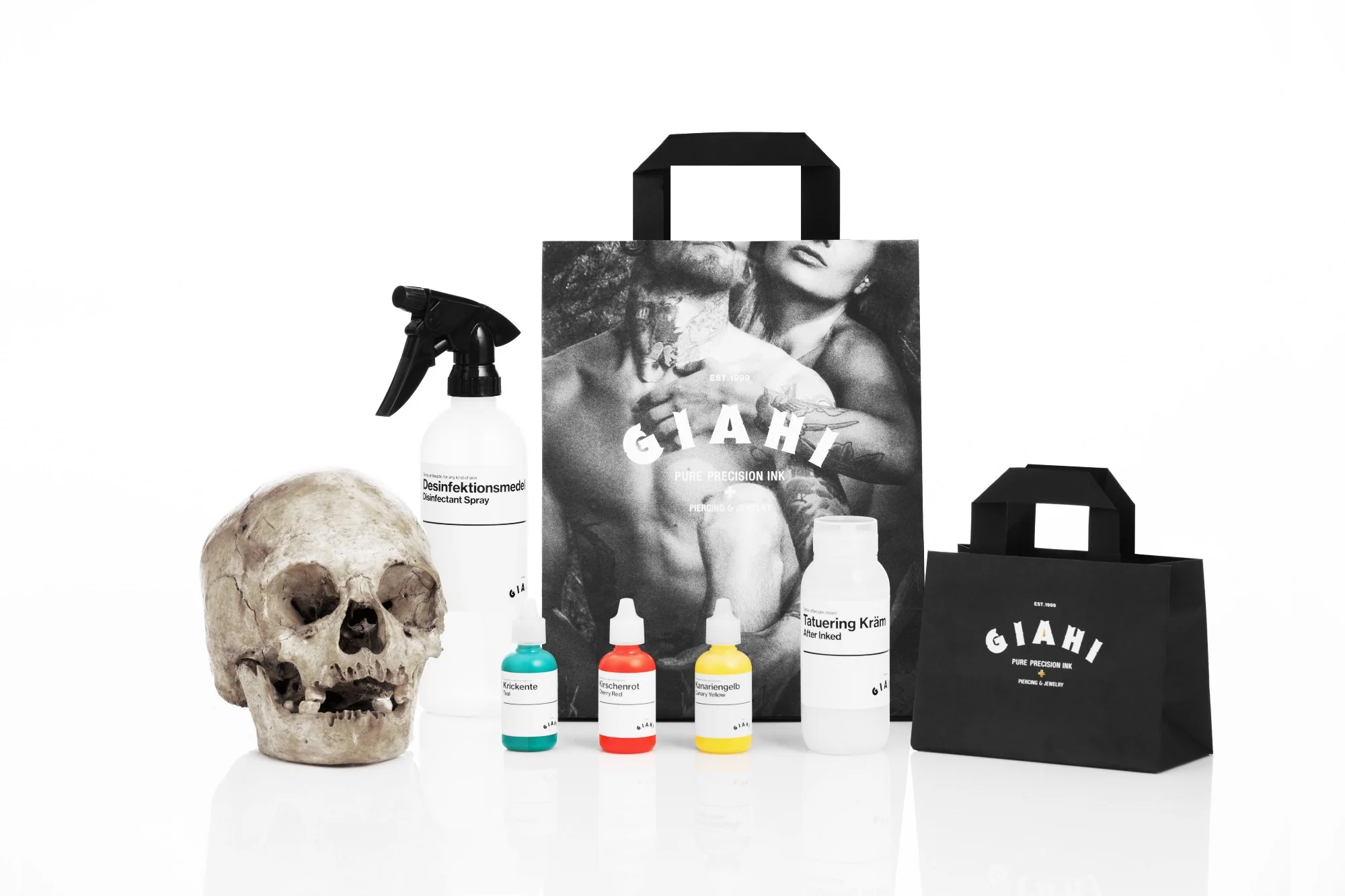
Giahi
Your previous clients include companies of different size from all over the world. How do you select among potential clients?
Fortunately, our clients are the ones that choose us. Nevertheless, we recognize that the fashion industry is particularly interested in us these latest years. All the projects are a new challenge for us, and we love challenges.
Helvetia Trust
One of your latest blog posts is about letterheads, in which case the proper use of typography is essential besides the grid, of course. How do you select typefaces for projects?
We describe the process carefully in the brief, in which we identify specific needs in base of what we want to communicate. A decision of typography has to do with the tone of voice that will identify the brand, the target market, the aggregated value, strengths, etc.
Colours plays a significant role in all of your projects, and the outcome — of course considering all elements of the design — is always a treatment for the eyes. You also elaborate on the use of colours in the project descriptions. How many versions do you design before finalising the project and show it to the client?
There is no specific number. Every project is unique, and the challenges are always different. To define a colour palette we make tests as many as needed until we feel sure that is the most adequate option.
What is the design process usually like?
Many sketch work, we like the classic methodology. The jump to the monitor happens when we have already selected a path on paper.
You’ve worked a large number of projects from strategic brand consulting to logotype, so you probably have plenty of stories to tell. What do you consider your greatest challenge and success so far?
Working in the logotype redesign of Armani Exchange has been one of the best experiences as a creative agency. We were aware of the project limitations, it exists a legacy and guidelines that we had to follow for the letter, but at the same time solve the challenge of communicating the renovation and repositioning of the identity. It was an amazing experience. And we love the result. We hope that we can add it to our online portfolio soon.
Enviaflores
What are you working on right now?
We are working hard on new branding, web design and architecture projects. Every Tuesday you can see an update on our portfolio.
What are your short- and long-term plans?
We keep working to grow and keep making amazing things around the world. We can’t tell a lot, but this year will be an amazing year for Anagrama.

